iTunes 11: Can no longer open playlists in separate windows

Posted by Pierre Igot in: iTunes
November 30th, 2012 • 11:20 pm

This one is a major disappointment for me: As far as I can tell, it’s no longer possible to open anything in a separate window in iTunes 11 (except for that new “Downloads” window, of course). It used to be that you could double-click on a playlist’s icon in the source list/sidebar to force iTunes to open the playlist in a separate window. No longer. If you double-click on a playlist’s icon under “Playlists”, it just starts playing it. If you double-click on a playlist’s name, it starts playing it and makes the name editable. And if you double-click on a playlist’s name in the sidebar… nothing happens. Wonderful, and undescribably elegant.

So now if you want to, say, copy track X from playlist A to playlist B, you can no longer choose where you are going to drop track X in the track list for playlist B. Your only option is to drop track X onto the playlist B icon, and then switch to playlist B, scroll down to the bottom of the playlist, and then drag track X to where you want it to in playlist B.

And if you want to compare something in the iTunes Store with the current contents of your library, well, good luck with that.

What’s next? Single window mode for the Finder too? Geez. Thanks for making life more complicated for us, Apple. I am really beginning to love the new iTunes (which is as fast and snappy as ever, by the way).


iTunes 11: Now comes with a separate ‘Downloads’ window

Posted by Pierre Igot in: iTunes
November 30th, 2012 • 11:11 pm

Very interesting. Having a separate “Downloads” window is apparently too complicated and not user-friendly enough for Safari, but it’s a perfectly good idea to add one to iTunes:

itunes11-downloads

Sometimes you really do wonder whether there’s anyone over there who cares about consistency.


iTunes 11: Column Browser bug and limitations

Posted by Pierre Igot in: iTunes
November 30th, 2012 • 3:42 pm

Here’s the first glitch I’ve encountered in iTunes 11 on my Mac Pro:

itunes11-columbrowser

When the sidebar is visible (“View › Show Sidebar”) and the source is a specific playlist rather than the default “Music”, the “Column Browser” submenu is greyed out and inaccessible.

If the sidebar is hidden and the source is a specific playlist, then the column browser submenu is accessible. But if the sidebar is visible, it’s not.

Initially, I also thought that the column browser didn’t work even for the main “Music” source. But in fact in order to be able to use it with “Music” as the source (rather than a specific playlist), you need to click on “Songs” rather than “Albums”, “Artists”, etc. After that, the column browser is available.

Unfortunately, in all cases, the column browser in iTunes 11 appears to be more limited than it used to be. It does not look like you can use the vertical layout (with columns on the left) anymore. Why did Apple have to take this away from us?

As for the column browser for playlists with the sidebar visible, I hope it’s just a glitch and something that will be fixed in an update soon.


Really Smart Paste: Keyboard Maestro and BBEdit to fix copied text from on-line database and other sources

Posted by Pierre Igot in: Macintosh, Microsoft, Pages
November 28th, 2012 • 11:02 am

As a professional translator in Canada, I am constantly referring to the TERMIUM database, which became accessible free-of-charge a couple of years ago as part of the Language Portal of Canada.

One thing I do not like when using on-line databases, however, is having to retype things. Whenever I have to look up a term, I tend to copy it from the source and then paste it in the search field in the database. Conversely, whenever I find a term in the database, I tend to select it in the on-line interface and copy it so that I can switch back to my word-processing application and paste it there.

This process raises several issues: text copied from an on-line database interface is, by default, in rich text format (with font face, character size, colour, etc.); it can be surrounded by undesirable white space that is copied along with it; and whenever the text contains apostrophes, which is quite common in my target language (French), these apostrophes tend to be straight and not curly.

All these things can be fixed manually after pasting the copied term in the target application, but it is of course rather painful to have to fix them each and every time or even to have to remember to do batch replacements later on. Which is why I have, over time, developed tools to help me automate this process.

Over the years, I have struggled with the idiosyncrasies of the target applications that I use (mostly Pages ’09 and Word 2011, but also Adobe InDesign, TextEdit, etc.). But now I believe I have come up with a solution that is pretty good and definitely increases my productivity, so I thought I’d share it here:

pastefromtermium

Unfortunately, as you can see, it involves the use of third-party tools, namely Keyboard Maestro and BBEdit. However, that’s what productivity enhancements usually are: they require an initial investment, but they pay off over time. (I have been a user of both third-party tools for a long time, so the enhancement required no new investment for me.)

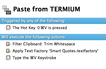
I chose the shift-command-V trigger because it’s easy to press, on my keyboard, with only the left hand, so that the right hand remains free to control the mouse, which tends to be necessary when dealing with on-line database interfaces. (They don’t have handy keyboard shortcuts for selecting search results.) I know this particular shortcut is used for other purposes in some applications, but these other purposes are far less important to me, so I’d rather use it for this. KM supersedes built-in application shortcuts, so it’s not even necessary to customize the application itself.

The first action in the Keyboard Maestro macro is a filter that trims the whitespace before and after the copied text. In my case, it enables me to work around a bug introduced by the revamped TERMIUM interface in Safari, which is that, when double-clicking on the very first search result to select it on the web, Safari also selects some invisible markup that ends up being converted into an extra carriage return before the text. (It’s hard to imaging anyone at either Apple or TERMIUM actually caring about this bug, so a fix will probably never happen.) The KM filter removes not only superfluous space characters, but also extra carriage returns. (For some reason, it also strips the formatting at the same time and converts the clipboard to plain text. But there is also a separate filter that does only that, which would be redundant here.)

The second action consists of applying a BBEdit Text Factory to convert straight quotes to smart quotes. KM has its own built-in filter for this, but it’s not as… smart as the one in BBEdit and can curl apostrophes the wrong way in some cases. The BBEdit Text Factory works very well.

Finally, the third action simply pastes the contents of the Clipboard, which has now been stripped of its formatting and the undesirable whitespace and also has had its straight apostrophes converted to curly apostrophes.

One additional benefit of this macro is that, for some reason, it also prevents the word processor’s pasting command from trying to outsmart the user by adding undesirable white space when inserting the text. This is particularly important in French, because there are many cases when I want to paste the term after a contracted l’ or d’ and I definitely do not want a space between the contracted article or preposition and the pasted text, which tends to happen otherwise. (I know that Smart Paste can be turned off altogether in Word 2011, but not in Pages ’09. And besides, Smart Paste is actually useful in other contexts. It’s just not smart enough to deal with all situations, and it’s definitely too English-centric.)

I should also note that, once this macro has been used once, the text in the clipboard remains in its stripped form, so it can be pasted again and again using simply command-V.

Finally, this macro is useful not just for pasting from TERMIUM, but also for fixing copied text from a variety of other sources. And it works the same in many different applications, including Pages ’09, Word 2011, InDesign CS6, etc.

It’s a bit sad that, after all these years, we still have to effectively “hack” our systems to make them behave properly as writing tools, but writing is only one of the many uses of a computer, and companies like Apple and even Microsoft tend to focus far too much on other uses. There is a definite lack of innovation in computing for writers, so our only option is to rely on third-party tools to enhance our productivity. Fortunately, these tools exist, and they work pretty well once you’ve learned how to use them.


Jeffrey Toobin’s profile of Elizabeth Warren in The New Yorker

Posted by Pierre Igot in: Language
November 22nd, 2012 • 9:22 am

I know it’s old news, but I came across this sentence this morning:

When Warren was six or seven, in Okhlahoma City, she told me…

So, apparently, Mr. Toobin’s astonishing journalistic skills include the ability to spot future US senators when they are six or seven years old and interview them right there on the spot.

Given that Mr. Toobin was born in 1960 and that Elizabeth Warren was born in 1949, the feat is even more astonishing. Jeffrey Toobin was able to intervew the young Elizabeth Warren before he was even born. Wow.

(I know, I know, it’s a bit of a cheap shot at an already stale piece of writing. But I do feel that The New Yorker’s standards have been slipping a bit lately. I also remember catching a forward meaning “foreword” in a fairly recent article, although I don’t have the exact reference.)


Mountain Lion: Extra zeros when editing date field in Numbers ’09

Posted by Pierre Igot in: Macintosh
November 21st, 2012 • 5:39 pm

Ever since I upgraded to Mountain Lion (at least I think that’s when it started), I’ve been experiencing this weird glitch in Numbers ’09, with table cells that are formatted using a yyyy/mm/dd date format.

The cell looks OK when I select it:

ML-Numbers-date

But then as soon as I enter it to edit it, I get this:

ML-Numbers-date-extrazeros

I have no idea where these four extra zeros come from. They don’t affect the editing of the date, except that of course they make things a bit more awkward, because the date no longer fits in the width of the cell and is now wrapped over two lines.

It seems to affect all my date formats. (In other words, no matter what date format I use, Numbers ’09 reverts to this format with the extra zeros when I try to edit the date.)

Today I decided to explore the issue further, and one of the first things that came to mind when thinking about this problem was that I have customized my default date formats in System Preferences. (I use French by default because OS X forces me to choose one language. I really wish OS X were more flexible when it comes to supporting the use of multiple languages simultaneously. But of course truly bilingual users are a minority, so…)

ML-date-formats

The only customization I’ve done is to change the short date format to display the year in full, because I find the short date with only two digits for the year quite unreadable.

And sure enough, as soon as I change the short date format back to two digits only:

ML-date-formats

I no longer get the leading zeros in Numbers ’09!

I guess the fix for now will be to leave the short date format with two digits only. I cannot remember why I wanted the four digits in the short date format as well, given that the medium date format for Canadian French is already yyyy-mm-dd. But there was a reason why I made the adjustment way back when. Maybe that reason no longer exists and all will be well. Maybe I’ll encounter a situation that will make me remember why I made the customization in the first place.

Gotta love all those little details that make one’s computing life… ahem, interesting, shall we say?


Lion/Mountain Lion’s Mail: Workaround for removing attachments from sent messages

Posted by Pierre Igot in: Mail
November 13th, 2012 • 9:28 am

In Lion (OS X 10.7) and Mountain Lion (OS X 10.8), Mail has a bug that, for certain types of e-mail accounts at least, causes the application to fail to identify sent messages containing attachments as such. The paperclip icon never appears in the message list, and the “Remove Attachments” command is greyed out, even though the messages do contain attachments, which can be confirmed by looking at the message contents of the individual messages.

There is a discussion thread about this particular problem on the Apple forums, which clearly shows that a number of users are affected. Over time, with Apple seemingly unable or unwilling to fix this bug, people have come up with various workarounds. The one I have come up with works reliably for me, although it is a bit tedious.

But now, on another discussion thread about the same issue, a user named oakmontoz has come up with a better workaround:

OK, I have no idea why, but the following worked.

I created a rule in the Preferences pane:
CONDITIONS
sender is me
attachment contains “.” (every file does)
RULE
set color to (anything)

The rule worked.
Furthermore, the paperclips appeared!!!

On the main discussion thread, a user named iBiM has come up with a more detailed description:

1 – Create a rule in the Mail Preferences pane
2 – Call it “Get My Paperclip Icons Back!”
3 – Set conditions as below :
A – If ALL of the following conditions are met :
B – From Ends With [Your email address here] (you can do this for multiple too]
C – Any Attachment Name Contain “.” [with the quotations around the dot]
Perform the following actions :
D – Mark as Read [which really makes no impact on how its viewed]

And the amazing thing is that it works! You still have to manually select the sent messages and use the “Apply Rules” command to force Mail to apply the rules (including the fix) to the selected messages, but after that, the paperclip icon indeed appears and the “Remove Attachments” command is no longer greyed out and works to remove the attachments from the message.

It is still rather shameful that Apple has not done anything about this bug in over a year (some people say that Apple has responded to their bug report by saying that it’s a “known issue”, which is more encouraging than Apple completely ignoring the problem, but they still haven’t done anything about this “known issue”), but at least we now have a workaround that is fairly easy to implement and use and will enable us to fix the problem manually until Apple finally fixes the bug itself.


Pages ’12: Top 3 list of improvements

Posted by Pierre Igot in: Pages
November 6th, 2012 • 3:04 pm

Pages ’12 obviously does not exist at this point in time. There have been no news about a new version of the iWork suite for OS X in years, and for all we know we might not get a significant update for another two or three years. Yes, the situation is that depressing.

This cannot stop me from fantasizing about what the next version of the Pages application for OS X might bring. So here’s my list of top priorities for new features and enhancements in the next version of Pages.

Hierarchical Style Sheets

I am getting really tired of having to change multiple paragraph style definitions every time my work requires a different font scheme. I typically have several different body text styles, all of which use the same font, the same character size, and the same leading. If I want to change one of these parameters in my document, I have to change it manually in each and every style I have defined. There is a reason why hierarchical styles (i.e. styles based on other styles) were invented. It’s time for Apple to get with the program.

The developers of the Pages application did a decent job of making styles more accessible in the user interface, presumably in order to encourage more people to use them. I think that adding the ability to define styles based on other styles can be done without making the interface too complicated. There is already a setting for “Following Paragraph Style” in the text inspector. They could use the same idea, although obviously basing a style on another style has more ramifications.

In any case, the pros outweigh the cons. If the addition of such a feature requires a more advanced UI, so be it. Apple can keep the current interface for those who are OK with the current situation, and add the hierarchical styles feature in a way that does not interfere with it. At least they should try.

Multiple Views of Same Document

I am not saying Apple should ditch the current WYSIWYG approach by providing multiple view modes, like Microsoft Word. I am saying that Apple needs to enable Pages users to view different sections of the same document at the same time. These different views can all be in the same WYSIWYG view mode. But we need to be able to view different sections of the actual document we are currently working on at the same time on our screens.

Right now, the only way to do this is to create a (static) copy of the current document in the Finder and open it in a separate window. But of course, if you do that, you end up with two different versions of the document, and you need to constantly double-check to make sure you are not editing the wrong one. Plus the static copy becomes outdated as soon as you make changes to the original, which forces you to make new copies all the time.

And then you have to clean up by trashing all these multiple copies. It’s painful, it’s inelegant, and it prevents writers and editors from doing a proper job. Cross-referencing and comparing sections are an essential part of composing documents. Pages needs to provide tools for this. (And so does Preview, by the way, for PDF documents.)

Better Customizability

As a power user, I would be tempted to request the addition of all kinds of customization features, like user-defined keyboard shortcuts (for features that are not accessible via the menu bar, and there are lots of those in Pages). But in fact, since becoming a Keyboard Maestro user, I have found that having such a system-wide customization tool is probably a better approach: it’s more flexible, more transparent, more powerful, and you don’t have to worry about where your customizations are stored and whether they will be preserved through system or application updates.

That said, Pages still needs improvements just to make it more compatible with Keyboard Maestro-based customizations. In particular, its AppleScript support needs to be improved. There are several things in relatively complex documents that cause Pages’s AppleScript support to lose track of the exact position of the current selection in the document, including (but not exclusively) the presence of an automatic table of contents. This is a bug that has to be fixed.

I also should not have to resort to GUI-based scripting in order to script some inspector-based features, like the value of “After Paragraph” spacing. In fact, anything that requires GUI scripting is a clear indication that AppleScript support in Pages ’09 is lacking.

There are of course plenty of other things that could and should be improved in Apple’s Pages. But when it comes down to it, the three priorities described above are the most urgent for me as a writer and editor working on relatively complex documents in the word processor. Pages ’09 is already a more-than-capable replacement for the word-processing horror known as Microsoft Word. But the implementation of these three priorities would go a long way towards making it even more capable and more plausible as a real word processor alternative.


Word 2011: Canadian French language imposes new French spelling

Posted by Pierre Igot in: Microsoft
November 4th, 2012 • 4:01 pm

As far as I can tell from the way Word 2011 runs on my machine, Microsoft’s Mac Office developers have once again demonstrated their crass ignorance of foreign language issues. Since 1990, there are two alternate spellings in French, the “traditional” one and the “rectified” or “new” spelling. The changes introduced in the new spelling affect approximately 2,000 words in French, including several very common ones. One of the most distinctive changes is the removal of the circumflex accent on the letters i and u in many words.

Word 2011’s spell checker does support both the traditional spelling and the new spelling. In the application’s preferences, you can choose between three options: 1) enforce the traditional spelling; 2) enforce the new spelling; and 3) tolerate both spellings at the same time.

However, in my experience, Word 2011 fails to follow its own preference setting, at least when the underlying language selected for the text is Canadian French. If your text is in Canadian French, regardless of the option selected in Word 2011’s preferences regarding the new vs. traditional spelling, Word will flag as incorrect words written in the traditional spelling. Here’s an example:

word2011-newfrenchspelling

In this screen shot, I have clearly instructed Word 2011 to enforce the traditional spelling in French. And yet, as you can see in the text in the background, the word maîtrise with a circumflex on the i is flagged as incorrect. And sure enough, if I right-click on the word to see what Word suggests, it tells me that the word should be written without a circumflex accent:

word2011-newfrenchspelling-sugg

This is in direct contradiction with the setting I have chosen in Word 2011’s preferences.

Now, I should note that the problem only occurs when the underlying language setting for the text is “French (Canada)”. When the underlying language is “French” (not Canadian French), the option in Word 2011’s preferences works as expected.

So you might say: Why don’t you just use the “French” language setting and avoid “French (Canada)” altogether? Well, it’s because the language choice also has an impact on punctuation. In modern Canadian French, there is no non-breaking space before the question mark, the exclamation mark, and the semi-colon, whereas there are still non-breaking spaces before these punctuation marks in standard French. (There is still some debate about this, but the revised punctuation has pretty much become standard in Canadian French today.) Since Word’s smart punctuation feature automatically inserts this non-breaking space, if I use the “French” language setting for my text, then, unless I turn the smart punctuation feature off, I will automatically get the non-breaking spaces, which I do not want in my texts in Canadian French.

I have looked for references to this spell-checking problem affecting Canadian French in Word 2011 on-line, in both French and English, but I have been unable to find any. It is of course completely incorrect to behave as if the new French spelling enjoyed widespread adoption in French Canada. People are just as divided about the new spelling on this side of the Atlantic as they are on the other side. So if Microsoft’s developers adopted this behaviour intentionally, they are completely in the wrong both from a UI point of view and from a linguistic point of view. And even if it’s unintentional, well, it’s a bug that we have to live with and that will probably never get fixed, like all the other bugs in Microsoft’s products.


iCloud headaches

Posted by Pierre Igot in: Macintosh
November 1st, 2012 • 9:09 am

I don’t know about this iCloud thing. I really don’t know…

I was away on a business trip earlier this week and had taken my iPad along. While browsing in Safari with the iPad, I noticed that my bookmarks bar contained two copies of a folder that I call “My Sites”, which contains bookmarks for the various web sites that I administer for my clients. When I clicked on one of the folders in the bookmarks bar, the full list of the contents of the folder would pop-up. When I clicked on the other one, what popped up was… an empty list.

So I used Mobile Safari’s built-in bookmarks management tools to delete the second copy of the folder in the bookmarks bar. And I thought nothing of it.

Then today I got back to my regular work environment on my desktop computer and noticed that, in my Safari bookmarks bar, the folder in question is completely gone!

In other words, it looks like the duplicate folder with the empty list of bookmarks that I saw on the iPad was the one that was showing up on my desktop Safari with the full list of bookmarks, and that the other folder with the full list of bookmarks on the iPad was a “phantom” copy of the folder that only showed up on the iPad.

Grrr.

Isn’t iCloud supposed to make our lives easier? How did this particular problem happen? How did iCloud become confused about my bookmarks and end up with a “phantom” copy of the bookmarks folder that only shows up on the iPad?

Who the hell knows… All I know is that I was able to solve the problem by doing the following:

  1. I turned bookmarks syncing off on my desktop computer.
  2. On the iPad, I renamed the bookmarks folder itself, thereby forcing iCloud to somehow “refresh” its copy of the bookmarks folder in the cloud. (I am using quotation marks here because the cloud is impenetrable and I have no idea what actually happened there.)
  3. I turned bookmarks syncing back on on my desktop computer.
  4. Soon enough, I had my bookmarks restored, with a full working copy of the bookmarks folder in question in the bookmarks bar, with the missing folder back in its normal place, with the new name.

I then simply changed the name back to my original folder name, and now it appears that all is well. But still… I simply should not have to deal with such issues.

I have also noticed a number of duplicate entries in my contacts on my iPad… Again, it looks like iCloud has worked its magic and made a mess of things.

I have a strong suspicion that, as more and more things are moved to the “cloud”, we are going to have to deal with more and more problems of this particular kind. The good news is that it probably means that professional troubleshooters are not going to be out of work any time soon. The bad news is that troubleshooting problems in the cloud is even more painful than on the desktop.

Years of fun ahead, as far as one can tell.


Apple Support Communities: Logging in takes you back to home page

Posted by Pierre Igot in: Macintosh
October 31st, 2012 • 1:20 pm

This is a constant annoyance and something that Apple does not appear to be aware of.

I am a registered user of the Apple Support Communities (formerly Apple Discussions) web site. Apple’s site is designed (presumably for technical reasons) so that it does not keep you logged in for very long. This means that you have to sign in on a regular basis if you want to use the site as a registered user.

I have configured things so that I get an e-mail notification each time someone contributes to a discussion thread that I have contributed to. The e-mail notifications work fine. They contain the text of the latest contribution, and the following footer:

apple-support-communities-email

To me, this clearly indicates that I should be able to

  1. go to the message in the thread in question, which, unless I am currently logged in, will show me the discussion thread as it appears to an anonymous visitor to the web site
  2. click on the “Sign In” link that appears at the top of the page:
    apple-support-communities-signin
  3. sign in and be taken back to the message in question in the discussion thread so that I can reply to it

Yet in my experience, this is not what happens. When I click on the “Sign In” link, I am taken to a sign-in page. The form is filled out automatically for me by Safari, so I just click on the button to sign in. And then, the site takes me back to the… home page of the Apple Support Communities.

This is utterly stupid and useless. The site should be smart enough to remember which page I was on when I initiated the signing-in procedure, and take me back there once I am signed in. And it directly contradicts the underlying message of “ease of use” that the footer of the e-mail notification contains. Having to go back manually (via the “History” menu) to the page containing the message that I want to reply to is totally unintuitive.

As far as I can tell, this problem has been going on for years, and the footer in the e-mail notifications suggests that Apple is not even aware of it.


PowerPoint 2011: Editing charts in Excel is a maddening process

Posted by Pierre Igot in: Microsoft
October 28th, 2012 • 3:37 pm

Editing PowerPoint slides with PowerPoint 2011 is absolutely maddening. As a professional translator, I sometimes have no choice but to work directly in PowerPoint, and each time I end up exceeding my frustration quota because of PowerPoint 2011’s sheer crappiness.

I’ve already written about PowerPoint flaws in the past. Each time I use the application, I find new ones to add to the list.

Today, I’d like to describe what happens when a PowerPoint slide contains a chart and you try to edit it. Typically, if the chart is editable, you can control-click or right-click on it to bring up a contextual menu:

powerpoint2011-editdata

Selecting the “Edit Data…” menu command in this menu automatically opens the source data for the chart in Excel. But the first maddening thing happens right away: Excel automatically zooms the window containing the data so that it fills your entire screen. On a 30″ monitor (and even on smaller monitors), it’s an absolutely ridiculous waste of screen real-estate and forces you to resize the window each and every time — which is particularly important because of the second major flaw in Excel when editing charts from PowerPoint.

That second flaw is that each edit that you make in Excel causes some kind of interaction with PowerPoint during which Excel becomes entirely unresponsive and ignores your keystrokes. Once the interaction is over (which can take anywhere from a fraction of a second to several seconds for a complex chart), the contents of the chart in the PowerPoint slide in the background are updated to reflect the edits that you made, and you can resume typing in Excel to make further changes. But any keystrokes made during the interaction are completely ignored and lost. They are not stored in some kind of buffer and entered in a spurt once the user regains control of Excel. No, they are simply lost.

It’s an infuriating flaw, because you have no idea when the interaction starts and stops (there is no change in the cursor). The only visual feedback you get is the change in the PowerPoint slide in the background, which you can only see if you resize the window in Excel that is zoomed to fill your entire screen by default!

The flaw even extends to mouse clicks. Anything the user tries to do in Excel during these interactions is lost. It completely breaks the flow of one’s work, and it’s impossible to avoid losing keystrokes and mouse gestures, and having to repeat them once you see that Excel didn’t register them. It drives me insane.

This only occurs when editing charts open from within PowerPoint. Otherwise, Excel works just fine. But when it used as an editor in a way that is linked to a chart in PowerPoint, it is impossible to avoid having to deal with the unpredictable periods of unresponsiveness during which Excel ignores and loses all user interactions with the data sheet.

I am tired of having to put up with this crap, but I have little choice. I suppose I could try working in a Windows version of PowerPoint under VMWare, but this would force me to purchase more Microsoft crap, and would deprive me of the use of tools such as Typinator, which at least makes text input somewhat less painful in Microsoft applications and in PowerPoint 2011 in particular.

There are many other maddening aspects in PowerPoint 2011. The constant disappearance of the blinking I-beam cursor while typing or using keyboard shortcuts for text navigation is another one. It’s a chronic problem that has plagued Microsoft applications for Mac OS X for years, and it’s particularly prominent in PowerPoint 2011, when editing text in text boxes. I constantly have to deal with the fact that I cannot see the I-beam cursor and therefore do not know exactly where I am in the text until I pause my typing just to allow PowerPoint to “catch up” with me and start blinking its cursor again.

What a piece of crap.


OS X 10.8.2: Hot corners not so hot with dual monitor setup

Posted by Pierre Igot in: Macintosh
October 26th, 2012 • 8:46 am

Among other glitches that I have noticed with the latest version of Mountain Lion (OS X 10.8.2), there is the fact that the “Hot Corners” feature accessible via the Screen Saver preference pane in System Preferences no longer works reliably.

I use hot corners to put my displays to sleep. I have two 30″ monitors in a dual monitor setup, i.e. with an extended desktop that spans both screens, and the menu bar on the screen on the right-hand side.

Prior to my upgrade to Mountain Lion, I was able to configure OS X to allow me to put my monitors to sleep by simply dragging my mouse to the top-left corner of either monitor. This worked fine.

Now, I find that, when I drag my mouse to the top-left corner of my main monitor (the one with the menu bar), which is on the right, most of the time, nothing happens. If I want to put my displays to sleep, I have to drag my mouse all the way to the top-left corner of my secondary monitor, which is the farthest corner on the left. In other words, it looks as if OS X treats my dual-monitor setup as one giant screen with only one top-left corner, the one in the top-left corner of my secondary monitor on the left.

This is simply not right. The “Hot Corners” feature should work on both monitors, like it did in previous versions of OS X.

I call this a glitch and not a bug because there are times when it actually works the way it used to be. Because of the (unrelated, except for the dual-monitor part) kernel panic problem with OS X 10.8.2, I have had to restart my computer quite a lot lately — much more than I used to. And so I have noticed that, sometimes, after a restart, the “Hot Corners” feature works normally again, with the top-left corner of my main monitor on the right working properly as a corner that can be used to put my displays to sleep.

But then the next kernel panic happens, and after the restart the top-left corner of my main monitor on the right no longer works as a hot corner.

It’s rather frustrating. I’ve now added the top-right corner as another hot corner to put displays to sleep, but of course, the more corners I add, the more likely I am to accidentally put my displays to sleep when I don’t mean to. So it’s not a perfect solution.

Still, it’s only a glitch. But sometimes one gets the impression that there are very few people in Apple’s labs who actually test OS X with dual monitor setups. I know we are a minority, but we are also people with enough disposable income to purchase multiple monitors, so maybe Apple should pay a bit more attention to our needs.


Fusion Drive Tech Note: Not too reassuring

Posted by Pierre Igot in: Macintosh
October 25th, 2012 • 3:51 pm

As someone who has been enjoying the benefits of using an SSD drive as my startup volume for a year now, I am of course intrigued by Apple’s announcement of the new Fusion Drive technology.

However, the fact that Apple has already released a tech note about the new technology with a series of warnings is not particularly reassuring. I find the bottom section titled “Troubleshooting” particularly worrying:

If your system will not start because you see a flashing question mark or another alert:

  1. Press the Power button and hold it down to power off your system.
  2. Press the Power button again. After you hear the startup chime, press and hold Command-Option-R to start up to the Internet version of Mountain Lion Recovery.
  3. A globe should appear with a “Starting Internet Recovery” message. It is now OK to release Command-Option-R.
  4. A progress bar should appear and Internet Recovery should start ask you to select a language.
  5. Once you select a language, click Disk Utility in the window that appears and then click Continue.
  6. If your Fusion Drive can be repaired with Disk Utility, you’ll see a Disk icon with red lettering. Click the disk icon.

In recent times, in my experience as a Mac troubleshooter, the flashing question mark (indicating an unbootable system) has become a fairly rare occurrence, and something that usually indicates a serious hard drive failure. (There are still times when running Disk Utility or a third-party tool such as DiskWarrior to repair the disk’s directory works and solves such a problem, but it’s pretty rare.) These days, if you get a flashing question mark, it’s usually a sign that your hard drive is toast and you need to replace it.

What this tech note appears to suggest is that the flashing question mark problem might occur more frequently with the Fusion Drive than with current drives, but that it’s not indicative of a hardware failure and can actually be fixed. There is a catch, however:

To repair the volume, click Fix. CAUTION: Clicking Fix will erase your Fusion Drive.

Maybe I’m reading too much into this. Maybe Apple is just being cautious and making sure that the required information is available in the rare cases when such a failure might occur. On the other hand, Apple is a company that tends to remain in denial about problems until reports reach some kind of internal critical mass. So this particular tech note looks rather unusual to me. After all, nobody except Apple people with access to prototypes is using a Fusion Drive right now.

Do potential buyers of the new technology really need to worry about a higher-than-normal failure rate for the new drives and the fact that, while these failures can be fixed with software, the fix involves erasing the drive?

I guess we’ll soon find out. But I personally would leave the experimentation to other early adopters for this particular technology. I am quite pleased with my current setup (256 GB SSD for system and applications and larger conventional hard drives for everything else) and with the fact that I am the one who gets to choose what goes where.

Of course, the ultimate goal of a technology such as the Fusion Drive is to simplify things and make them accessible to “the rest of us” (i.e. people with less technical know-how), and it is laudable. But reading such a tech note makes me feel like there is a risk that this technology might not be quite ready for prime time just yet.


OS X 10.8.2: Safari windows restored without drop shadow

Posted by Pierre Igot in: Macintosh
October 24th, 2012 • 8:34 am

Last week, I wrote about a number of outstanding glitches in OS X 10.8 (Mountain Lion). Here’s another one, which I forgot to mention at the time:

mountainlion-windows

The problem is fairly obvious: When Safari is launched and proceeds to restore its windows (for example, after an application crash, which is what happened in this particular case; but the problem also occurs after a simple quit-and-relaunch), it somehow “forgets” to add the drop shadow around the edges of all the background windows. (The frontmost window does get the deeper drop shadow, as expected.)

Since the drop shadow is effectively the only visible edge of a window in OS X 10.8, this glitch has pretty obvious and rather ugly results.

Hiding Safari and bringing it back to the foreground fails to force OS X to restore the missing drop shadows. The only fix that I have found is to cycle through all windows. When one of these windows without the drop shadow is brought to the foreground, it acquires the foreground drop shadow. And then when it’s relegated to the background again, it correctly switches to the (shallower) background drop shadow.

It’s just a visual glitch, but it’s a pretty obvious one.

Now, I should note that I see this problem primarily with Safari windows on my secondary screen. I have a dual-monitor setup (right now a source of other on-going problems) and I tend to keep my Safari windows on my secondary monitor (i.e. the one without the menu bar). I don’t know if it has anything to do with anything.