Dumbing down Mac OS X: Lion’s Address Book
Posted by Pierre Igot in: MacintoshJanuary 15th, 2012 • 4:45 pm
Mac OS X’s Address Book application has never been a particular good piece of software. In fact, I distinctly remember writing a pretty scathing blog post about the multiple problems with its “Edit” mode six years ago. (To be fair to Apple, most of the problems described in that post were eventually fixed, but it was still embarrassing that a finished product contained so many obvious, sloppy bugs.)
But with Lion’s version of the application (no. 6), I fear that, under the influence of the corresponding iOS app (called “Contacts”), Apple has taken a big step back in usability, and I’d like to explain why here.
To begin with, there is the obviously problem with the switch to what is called a skeuomorphic design that imitates the look of a “real” address book:
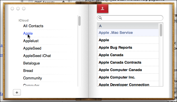
Beside the purely aesthetic aspects, what is obviously problematic about this design is that, unlike the previous version of Address Book, it can only ever display two colums of stuff at any given time: either the list of groups on the left and the list of entries in the currently selected group on the right, as in the picture above, or the list of entries in the currently selected group on the left and the card details for the currently selected entry in the list on the right:
(If you are really masochistic, you can even reduce the interface to a single column by clicking on the button with the square icon in the bottom-left corner.)
When you think about it for two seconds, it’s obvious: in a real address book in which you write down your contacts by hand, the very concept of a group does not exist. The best organizational tool you get is the alphabetical order. You cannot organize your entries in groups. The very concept of groups is one of the key benefits of having a computerized address book in the first place! With an electronic address book, you can organize your contacts not just by alphabetical order, but also based on specific categories. In an age of ever-expanding social networks, this is an essential feature if you want to try and be somewhat organized in your work or in your life.
By forcing us to adopt the two-column approach imposed by the skeuomorphic design, Apple is effectively deprecating groups as a feature. They are still there, but using them has just become much more painful. You cannot see groups or select one at all while you are viewing the contact details of a specific card. You first have to click on the red bookmark button at the top:

(Apparently, Apple has also decided that tool tips are now optional and that Mac users are smart enough to figure out what this button does by themselves — whereas in iOS the two-head icon is replaced by a text label that says “Groups.”)
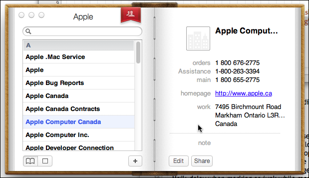
In addition, when you are viewing the column with the groups on the left, as in the first picture above, the currently selected group is barely visible. The only sign that it is selected is that the name of the group is in blue instead of being in black. Where else in the Mac OS X user interface is text colour a form of selection highlighting? The nearly universal way of highlighting a selection is to change its background colour. (To highlight the selected card or cards, Address Book 6 changes not just the text colour, but also the background colour, to a light shade of blue. But it does not do that for groups.) And there is no icon next to the group’s name to indicate that it is a group instead of a card. Visually speaking, it’s almost as if groups no longer existed. It’s as if Apple was really trying to discourage us from using them at all.
(And when you are viewing a specific card after selecting it in “All Contacts,” there is no longer any direct way to tell which group(s) it belongs to. In previous versions of Address Book, you could hold the Option key down while a specific card was displayed. This would highlight in yellow the parent group or groups to which the card belonged. If you want to do this now, you first have to switch back to the view with the groups on the left and the list contacts on the right, so that groups are actually visible. Then holding the Option key down still works, but the parent group(s) are highlighted in the same faint way as the highlighting used for selection, i.e. the groups’ text colour changes to blue. And of course because of the new skeuomorphic design, the number of groups visible at any given time on the left is smaller than it used to be, even if you make the window as big as you can. So if, like me, you have a large number of groups, there’s lots of extra scrolling involved.)
What justification can there be for deprecating the Groups feature like this? Sure, I know that many computer users don’t even bother to maintain a proper address book at all and just rely on their software’s automatic memory of previously-used recipients (such as the “Previous Recipients” feature in Mail). But is that really an excuse? Did Apple really have to make the Groups feature in Address Book more difficult to use because of this? What is gained by removing groups from view? Simplicity? Obviously, if this many computer users don’t bother to maintain an address book at all, it is because even a simpler user interface is still too complicated for them. I’d very much like to see the scientific studies of Mac users Apple has conducted that prove that a “simpler” user interface like the one in Lion actually makes the address book more useful and more likely to be used.
Yes, it now looks very much like the Contacts app in iOS, but is that a sign of progress? To me, it is just a sign of dumbing things down and catering to the lowest common denominator. (And, despite appearances, it does not even work the same way. There are numerous differences between the way the Contacts app works and the way Lion’s Address Book application works. More on that below.)
I would also very much like to know how Apple’s engineers can rationalize the fact that, when you are looking at the Address Book application with the groups on the left and the list of contacts on the right, there is no button to create a new contact. As I’ve written before, I find this completely mind-boggling. In this view, the only way to add a contact to the currently selected group is either the “” command in the “” menu or its keyboard shortcut. Why on earth is there a “+” button in the bottom-left corner for creating a new group and not one on the right for creating a new contact? How often does the average user create a new group compared to how often he creates a new contact?
I submitted an “Enhancement Request” to Apple about this a few months ago, and in December I got the following answer:
Hello,
Please let us know if the problem you reported below is fixed or not in the latest version of the software available to you.
Also, You can use the File > New Card menu item, or its Cmd-N shortcut.
Needless to say, the latest version of OS X that they were referring to did not contain any improvements, and the “” menu item and the command-N shortcut remain the two only ways to create a new contact. Sometimes I feel like I am talking to a wall.
(In the Contacts app in iOS, at least, as soon as you select a group, the app automatically switches you to the view with the list of contacts on the left and the card details on the right, where there is a “+” button at the bottom to create a new card. In the app, there is no such thing as a view with the groups on the left and the contacts in the currently selected group on the right, so the problem does not exist. On the other hand, this means that, when you go back to the list of groups, the entire right-hand side of the address book remains blank and is a complete waste of screen space. So the Address Book application and the Contacts app don’t work the same way, and are both flawed in different ways.)
There are other problems with the new Address Book interface in Lion. As with previous versions of Address Book, if a specific group is currently selected, the “Find” function only searches for matches within that group. If you want to search for matches in all your contacts, you have to remember to first go back to the list of groups and select “All Contacts.” It was already like that in previous versions, but now with the two-column view, it requires even more mouse clicks.
As far as I can tell, there is no shortcut for automatically selecting all contacts before starting a search. With previous versions of Address Book, I had written a Keyboard Maestro macro to automatically select all contacts before selecting the search field. Of course, with Lion’s Address Book, I was forced to rewrite my macro. I managed to do so, but even with my rewrite, the skeuomorphic Address Book UI is significantly more sluggish now, which means that there is a very noticeable delay when I trigger the macro before I can actually start my search.
It’s all very irritating.
I am not even talking here about the absurdity of this skeuomorphic UI in the first place. Think about it: when is the last time you had in your hands a “real” address book where there was a list of groups on the left and a list of contacts on the right and when flipping a page actually switched the contents of the right page to the next left page and showed the contact details on the right? Last time I checked, a handwritten address book consisted of plain pages with stuff written on them, and flipping pages just took me from one item to the next.
And if the idea is to imitate some kind of “index” or “table of contents” page, then tell me, do you really know of any book readers who have never wished that they could look at both the index or table of contents and the actual contents of the book at the same time? It’s so obvious that this is an improvement! Yet, that’s exactly what Apple has taken away from us with this “new and revamped” user interface.
It drives me so mad that I have finally given up on it and am now using a third-party application that I once bought as part of a cheap MacUpdate bundle without thinking I’d ever use it. The application is called Contactizer Pro. It’s far from perfect, and it too requires extra mouse clicks compared to what the pre-Lion Address Book application used to require. I’ve also send feedback to the developer (Objective Decision) about a bug and never received any answer, so I am not particularly impressed. (As well, the application offers all kinds of other features that I don’t use, which makes for a more cluttered interface.)
But at least, it has, you know, a three-pane view mode that lets you view groups, their contents, and card details all at the same time! And there is a “+” button for adding a new contact no matter what you are currently looking at!
Contactizer Pro uses the same contact database as Address Book, so any change to your contacts is immediately reflected in any application that uses that database, such as Mac OS X’s Mail.
Sadly, there is no way to tell which group(s) a card currently belongs to, in part because Contactizer Pro has its own “Category” feature that works separately. This is frustrating to me because my whole Mail/Address Book environment is built on a series of groups that I used in Mail rules to apply different background and text colours to incoming messages depending on which group(s) their sender belongs to. I am completely dependent on this colouring scheme to make my Inbox more manageable, but obviously Apple’s engineers don’t feel that it is a valid or important use of Mac OS X’s feature set. (They still haven’t fixed the bug that causes some messages to lose their colour when you reply to them either. Unfortunately, contrary to what I wrote in that older blog post, the bug also affects background colours, not just text colours.)
The whole situation reeks of arrogance. Apple’s engineers make assumptions about the ways in which we use their software, and apparently feel no qualms about deprecating some important features or making them more difficult to use in the name of “simplicity” and “user-friendliness.” I don’t know about you, but to me there is absolutely nothing user-friendly about this new skeuomorphic user interface and, once again, it makes me fear the worst about Apple gradually dumbing down the Mac OS X environment to make it more like iOS and less like a user environment that real people actually try to do real work with.
January 16th, 2012 at Jan 16, 12 | 7:18 pm
[…] Pierre Igot: By forcing us to adopt the two-column approach imposed by the skeuomorphic design, Apple is effectively deprecating groups as a feature. They are still there, but using them has just become much more painful. You cannot see groups or select one at all while you are viewing the contact details of a specific card. You first have to click on the red bookmark button at the top […]
February 16th, 2012 at Feb 16, 12 | 5:02 pm
[…] I’ve noted in a recent post about Address Book, the application might look more like its iOS counterpart, but there are numerous inconsistencies […]
March 15th, 2012 at Mar 15, 12 | 8:32 am
[…] a couple of months ago I wrote a post about Lion’s Address Book. The post covered a number of issues, but one of the key points was that the new user interface for […]