Word 2011: Can’t beat that polish
Posted by Pierre Igot in: MicrosoftMarch 8th, 2011 • 9:44 am
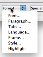
With all the bugs and glitches that I am highlighting in Word 2011, I should probably strive to be a bit more fair and balanced and give Microsoft props when props are due. And I must say that, in Word 2011, they have outdone themselves in the aesthetic department, especially with controls that really look like they were designed with an extraordinary amount of care:

Beautiful, isn’t it? I mean…
The “Format” button text tucked right against of the left edge of the button? Lovely.
The menu that pops up below the control instead of popping up on top of it, because the button text is actually the button label and not one of the pop-up menu’s options? Slick.
The top-left corner of the menu that is square when the other three corners are round? Smooth.
And the top edge of the menu that hides the bottom edge of the button? Delightful!
It’s just so pleasant to be able to use such a carefully designed piece of software.