iCal: Basic flaws in user interface
Posted by Pierre Igot in: MacintoshFebruary 16th, 2006 • 12:16 pm
Mac OS X’s calendar application, iCal, has now been available for years. It started at version 1.0 and is now at version 2.0.3. Sadly, however, when it comes to the user interface, there has been very little progress made since the very first version. It looks like Apple’s engineers made some fundamental design decisions when they first created the program, and have decided to stick with them in spite of the fact that they are utterly non-intuitive and suffer from some pretty obvious flaws.
In that respect, iCal is pretty similar to that other brushed-metal application that is a core part of Mac OS X, the Address Book application. I have already had the opportunity to describe some pretty fundamental flaws in Address Book’s Edit mode.
Now it’s iCal’s turn. Here is a sample of the flaws that affect this particular application.
To me, the most significant flaw is that iCal events can be edited in two different locations at the same time, namely in the calendar itself and in the Information drawer/inspector window. (The drawer can be turned into a separate inspector-like window using the “” command in the “” menu, and conversely the Information inspector window can be turned back into a drawer using the “” command in the “” menu. The flaws are the same whether you use the drawer or the inspector window.)
Given that it is possible to edit the same thing in two different locations, you’d think that the most fundamental requirement would be that both these locations be in sync with each other at all times. Yet iCal is already flawed at this very fundamental level.
Here’s a typical situation in iCal. You double-click on a day in the calendar to create a new event on that day. iCal creates the event, called “New Event,” and automatically selects the text label of the event in the calendar:
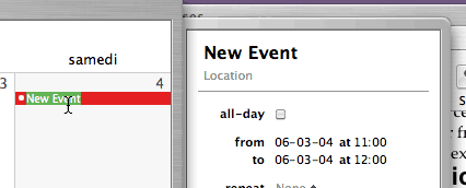
As you can see, however, the text label in the information drawer (the top-most item in the drawer) is not selected—even though it is very much the same thing and is going to change to whatever you’ll type in the calendar day itself.
Now look at what happens when you do type some text in the calendar:
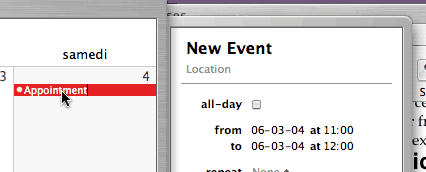
Now “New Event” has been replaced with “Appointment” in the calendar itself, but the text label for the event still reads “New Event” in the information drawer!
It’s only when you click elsewhere or press Tab to “exit” the text label in the calendar itself that iCal finally deigns updating the information drawer to make it match the contents of the calendar itself:
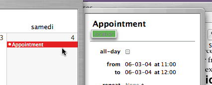
Of course, there is absolutely no indication to the user that he’s expected to do this (click elsewhere or press Tab) in order to get iCal to sync the contents of the information drawer with what he’s just typed. Why would the user know that he’s expected to press Tab when he’s typing text in the calendar itself? The user might be expected to know that he should press Tab if he were already in the information drawer and if the “New Event” field was clearly selected/highlighted as a text field. But, as we’ve seen above, the “New Event” text field is not selected, even though, technically speaking, the user is indeed currently typing text in it.
This is pretty bad. At the most basic level, when it comes to simply creating a new event in the calendar, iCal is fundamentally, horribly flawed. And it’s been like this from day one. It’s hard to believe that no one at Apple believes this to be a problem. It’s not like Mac OS X is not powerful enough to be able to keep the text field in the information drawer and the text field on the calendar itself in sync and update both at the same time as you type in either one of them!
Now, believe it or not, it gets worse. iCal also suffers from pretty horrible problems when it comes to wrapping text in cases when the text label for an event is too long to fit on a single line in the calendar itself. This is a problem that depends on the actual overall size of the iCal window itself. For some window sizes, it doesn’t happen. For other window sizes, it does. When it does occur, here’s what happens.
You start typing the text label for an event in the calendar. As long as the text fits on a single line, things are fine:

But now look what happens when the text becomes too long and iCal has to start a second line:

Where the hell has my first line of text gone? This is completely ridiculous. I have just typed the following text: “testing this stupid iCal text wrap”—and iCal is utterly unable to wrap the text properly over two lines!
Of course, usually, once the user presses Tab or clicks elsewhere to exit the event text label field, iCal does finally “refresh” its display and shows the full text properly over two lines:

But even then, the key word here is “usually.” Because sometimes, even after exiting the text field, iCal still doesn’t display the two lines of text properly. I cannot reproduce this every time, but I had it happen to me earlier today while I was in the process of testing this stupid text wrap thing. Here’s what I had in the text label field for the event in the information drawer:

And here’s what I had for the same text label field for the event in the calendar itself:

This was after having exited the field altogether. I kid you not. iCal had actually completely failed to wrap the text properly in the calendar itself, and was simply behaving as if the second line of text did not exist. It’s only after I actually resized the entire iCal window itself that finally iCal decided to “refresh” the text label display in the calendar itself and actually show the two lines of text:

It has to be seen to be believed. Like I said, you might not be able to reproduce this with your current window size, but it definitely happens for certain iCal window sizes, since the window size has a direct impact on the size of each day frame in the calendar itself.
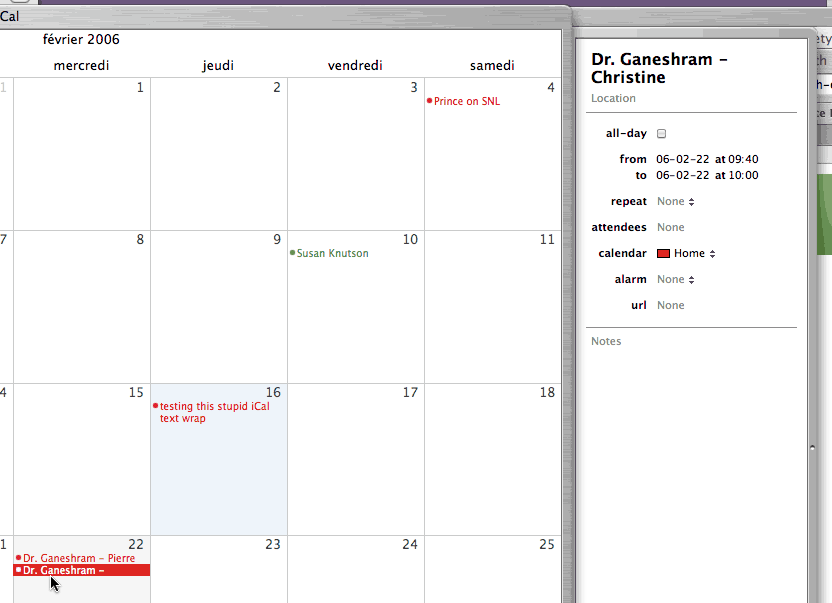
And it doesn’t just occur for new events that you’ve just typed in. Even the text labels for existing events that you typed in a long time ago can be affected, depending on the overall iCal window size and of the size of the text label itself. Here’s the ultimate proof:
As you can see, the text label is supposed to read “Dr. Ganeshram – Christine.” That’s what it reads in the information drawer. But in the calendar itself, the last word is completely gone (even though another event with two lines of text in the other cell above it is displayed properly). And it won’t come back even if I deselect the event. The only way to make it come back is to resize the entire iCal window.
This is really quite ridiculous, isn’t it? It’s the kind of bug that you might tolerate in version 1.0 of a new product. But not after several years of fine-tuning and upgrades!
iCal also suffers from pretty basic design flaws when it comes to indicating to the user exactly what is currently selected in the user interface. We have already seen above that, when you first type in a new event in the calendar itself, iCal fails to select the text label for the event in the corresponding area in the information drawer.
In other words, if I start typing a new event in the calendar, things look like this. The event in the calendar itself is highlighted using a selection colour that is based on the colour chosen for the calendar itself (red in this case):
![]()
But it’s not technically the same kind of selection that you would get in a normal text field, because, as you can see, the insertion point (the I-beam cursor) is also visible here after the “is” word. In other words, it’s a kind of highlighting that indicates that the event itself is selected, but not the text in the text label itself. Indeed, if you select the text in the text label itself, you get your other, normal selection colour (green on my system) superimposed on top of that selection colour that’s used to indicate that the event itself is selected:
![]()
I suppose this is OK. What is not OK, however, is that, once again, the corresponding text in the information drawer is not selected at the same time:

In fact, in the information drawer, nothing is selected. But if you then press Tab, all by magic, all of a sudden iCal does decide to select the next text field, i.e. the “Location” field here in the information drawer:

In other words, the first field in the information drawer (the one with the text label, “this event is” in this case) was selected—but we just couldn’t see it. Yeah right.
Now let’s go back to the calendar itself. After having pressed the Tab key and getting the “Location” field selected in the information drawer, we get this:

We still have the red selection colour, but not the green. In other words, the text of the text label for the event is no longer selected, but the event itself still is, right? So now if I press the Delete key to delete the event, it should work, right?
WRONG. It might look like the event itself is still selected, but in fact the focus is not on the event itself. It’s on the “Location” field, remember? The thing is, there is nothing in the iCal interface that indicates this. There is no variation in the shade of this red selection colour that would indicate that the focus is no longer on the event itself in the calendar (even though it’s still selected).
It’s a fundamental problem with the information drawer/inspector thing. There is no indication of where the focus currently is, other than the fact that the “Location” field is selected. But that’s not enough. If the focus is now on the drawer/inspector and not on the calendar itself anymore, then there should be some visual clue of this. Something like a blue halo around the edges of the drawer or something.
It actually is a fundamental problem with window drawers and inspectors in general in Mac OS X. We’ve already seen a similar problem with the drawer in Preview when viewing PDF files. Apple still hasn’t solved the problem, and all applications that use drawers/inspectors still suffer from the same lack of visual clues. In the case of iCal, it’s particularly glaring. You can have an event that’s selected in the main calendar area of the window, and yet operations that normally apply to selected items, such as deletion with the Delete key, simply don’t work, because the focus is actually on the drawer, even though there is no real indication of this, especially not in the main calendar area. (The selected event looks exactly the same whether the focus is on the calendar area or not.)
There are more problems with the contents of the information drawer/inspector itself. It contains a number of fields and check boxes, which you can tab through using the Tab key (once the focus is on the drawer, that is). All of these fields have text labels indicating their content—except for the first two fields, the event text label itself and the “Location” field, which behave like those fields in Address Book when in “Edit” mode. (There is no “Edit” mode to switch in and out of in iCal—which is part of the problem too, of course.)
Intriguingly, however, some of these field labels can have another function, which you will only discover if you actually hover with your mouse pointer over the field labels. If you do that, you’ll see that some of them, like the “alarm” field label, actually change their appearance when you hover over them:

This is supposed to indicate that these field labels actually can actually also be used as buttons. If you click on them with the mouse, you get a contextual pop-up menu:

That’s interesting, you might think, but why is the “Add Alarm” command greyed out here? Am I supposed to use this menu to add a new alarm? If so, why is the command unavailable?
The truth is that this command is only active if there is already an alarm defined for this event. How come? Because this command is actually meant to enable you to add a second alarm, that’s why. In order to define the first alarm for an event, you don’t need to use this menu. In fact, you cannot use this menu. You are supposed to understand that you need to go in the alarm field itself (which itself turns into a pop-up menu) and select the type of alarm you want.
All this is very obvious, isn’t it? An “Add Alarm” command that is not used to add an alarm, and is actually only meant to be used to add a second (or third, or fourth) alarm to an event that already has an alarm.
Once you know how this works, I suppose it makes sense (sort of). But it is still puzzling to think that Apple expects users to discover all this by themselves, without any proper clues. Why not call this command “Add other alarm,” for example? Come to think of it, why not use the “+” and “-” signs used elsewhere in Mac OS X, as in Address Book, for example?
I suppose that would be too consistent for the tastes of Apple’s engineers. Gotta have that unique style, ya know.
Yeah. In a calendar application. Sure.
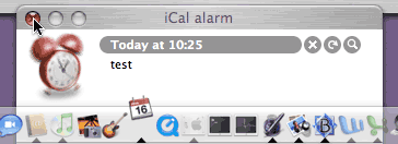
Last, but not least, a little pet peeve of mine with iCal. Whenever an iCal event triggers an alarm with a message while iCal is in the background, an alarm window pops up and the iCal icon starts bouncing in the Dock:
Fine. I positively hate this icon-bouncing-in-the-Dock thing to grab your attention, but that’s another issue.
As you can see in the screen shot, the iCal alarm window is actually a background window. In other words, if you are in, say, BBEdit, and an alarm comes on, the iCal alarm window comes up, but it comes up as a background window. It actually comes in front on the current front-most window, but as a background window. The current front-most window stays technically in the fore, even though this background window is suddenly on top of it.
It’s kind of weird, but at least it doesn’t interrupt you while you are typing something.
The thing is, however, that there are two ways to close this alarm window. You can either click on the little “x” button inside the window itself, next to the “Reload” and “Zoom” buttons.
Or you can click on the window’s red “Close” button. I must admit that my natural inclination is to use that red button, simply because it’s an easier thing to target: it’s in the corner, and it actually changes to a red button when you hover over it—whereas the “x” button doesn’t change at all when the mouse is hovering over it, so that you cannot be entirely sure that you mouse is properly positioned to click on it.
The problem is that, if you close the window with the red “Close” button, Mac OS X closes the alarm window, but the iCal icon keeps bouncing in the Dock! In other words, even after you’ve closed the window, you are still forced to switch to iCal, just in order to make the icon bouncing stop. There’s nothing to do once you are in iCal. You just have to switch to iCal to make the bouncing stop.
This means that we now have a background application requiring our attention, but when we switch to it, nothing happens, except that it doesn’t require our attention any more. So why is it requiring our attention in the first place? Last time I checked, the bouncing in the Dock is supposed to indicate that something is happening in the background application that requires the user’s attention. But once the alarm window has been closed, nothing is happening in iCal!
It’s a small thing, but it’s endlessly irritating, especially for someone like me who doesn’t like the icon bouncing to begin with. (I’d prefer a much less intrusive form of attention grabbing.) Clicking on the window’s red “Close” button should be equivalent to clicking on its “x” button, period.
But of course, if you click on the “x” button, Mac OS X actually brings iCal to the foreground, whether you like it or not. In other words, there is no way to dismiss an iCal alarm without switching to iCal. It’s… irritating.
Well, that’s it for me with iCal today. There are probably other things to mention, but I think this is long enough as it is. The bottom-line is that it is quite unacceptable that this iCal application still has so many basic user interface flaws after so many years. There are only so many bug reports that you can submit again and again for years until you finally throw your hands in the air in frustration and decide that they are never going to fix these things anyway and that you’re wasting your time.
February 16th, 2006 at Feb 16, 06 | 7:37 pm
[…] At Betalogue, Pierre Igot offers a demolition job on iCal’s user interface. […]
February 17th, 2006 at Feb 17, 06 | 9:50 am
Good start. I look forward to the instalments on the lack of per-hour / day / week background customisability (lunchtime, or weekend, anyone?); the mess of dragging events to / from the To-Do list; the time-display clunk; the lack of complex rules and numbering options for repeated events; the daft “auto-sorting” and the inconsistency in drag-resizing of day events; the lack of an option to display notes within events; the lack of an acceptable way to add a link from an event to a file on your disk (and vice versa); and the simply astonishing “Show X hours in a day” preference.
February 17th, 2006 at Feb 17, 06 | 4:11 pm
Regarding the first part of your post, the workflow isn’t that obtuse:
– Type in the event name and hit return/enter or click elsewhere to enter the text (like any standard text field).
– Type in the event name and hit tab to continue entering event details.
Although it’s a little strange to “jump” into the detail view by hitting tab, it’s nice to be able to do that via the keyboard, and I can’t think of a more appropriate key. (Well, maybe just return/enter could….)
You argue that the large Event Title in the drawer should be selected and change with the text in the calendar box. I think that could potentially be confusing for the user to see two separate objects being selected and edited at the same time. I suppose both text fields could update as you type, and there is an option for that in Cocoa Bindings, but two active selections in two parts of the interface strikes me as weird.
The thing that bothers me most about Apple’s new interfaces is that they are non-standard (not defined in GUI guidelines) and that they aren’t made available for developers to use. I think they’d be more consistent if they were. I also think they should update and evolve them with OS version and NOT on an app by app release basis.
February 18th, 2006 at Feb 18, 06 | 5:01 pm
I didn’t say that the workflow was necessarily obtuse, but that it results in some very non-intuitive visual behaviour, with the field in the drawer not being in sync. I don’t see what would be confusing about having the field updated as you type. To use a comparison, in Word you can have two windows or two panes in a window showing the same section of a document at the same time. If you type text in one, the text appears as you type in the corresponding location in the other pane/window.
Same thing in the Finder if you have two different windows showing the contents of the same folder. When you create a folder in one of the windows, the folder immediately appears in the other one as well.
Nothing confusing about this. If Apple was to give us two simultaneous views of the same thing, then these two views need to be kept in sync.