Finder: Spring-loading in Sidebar leads to confusing display
Posted by Pierre Igot in: MacintoshDecember 19th, 2005 • 3:28 pm
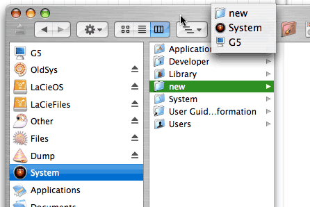
Like most people I suspect, I have several volumes listed in the top half of the Sidebar in my Finder windows. For example, I have a volume called “System” with the following contents:
Then I have another volume called “Applications” with the following contents:
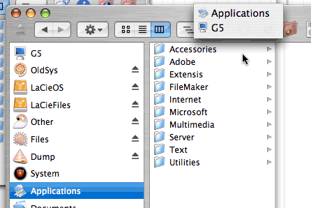
Both pictures were taken after having command-clicked on the window’s title bar, in order to show the exact path to each volume. It’s pretty straightforward stuff.
There is a problem, though. Let’s say I select the folder called “new” in my “System” volume, as illustrated in the first picture above.
I take that folder and drag it onto the “Applications” volume in the Sidebar. I keep my mouse button held down until the “Applications” volume selection “flashes” in the Sidebar and the Finder “spring-loads” the contents of the “Applications” volume in the main area of the Finder window.
And then, still without releasing the mouse button, I drag my “new” folder and drop it on the main area of the Finder window, where the Finder has just loaded the contents of the “Applications” volume—and now I release the mouse button.
Here’s what I get after releasing the mouse button:
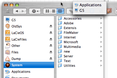
As you can see, the Finder has copied the “new” folder to the “Applications” volume, as expected. No problems here. But look at the Sidebar: the selection is still the original “System” volume where the original “new” folder came from—even though the main area of the Finder window now lists the contents of the “Applications” volume!
This can be seen quite clearly with the pop-up menu showing the path in the window’s title bar. This Finder window is indeed showing the contents of “G5 › Applications.” But the volume selected in the Sidebar is still “G5 › System”!
As we say in this family, this is a rather problematical problem. The Finder should either change the selection in the Sidebar to the destination volume, or it should refresh the window’s main area to show the contents of the original volume again.
Yet, as you can see, the Finder has no qualms about displaying a Finder window in which there is no connection between the Sidebar selection and the contents of the window’s main area.
I think this is extremely confusing—and is also a typical example of what’s really wrong about the non-spatial Finder in Mac OS X. I am not against a non-spatial Finder from a philosophical point of view. In fact, I spend most of my time in column view in Mac OS X, because it is my preferred view mode.
But a non-spatial Finder should not be an excuse for such user interface sloppiness. As this example illustrates, a non-spatial Finder introduces all kinds of new possible scenarios that were not possible in the purely spatial Finder of the classic Mac OS—and it seems quite obvious to me that Apple’s engineers simply have not taken the necessary precautions to ensure that all these new possible scenarios are examined and handled in a way that always preserves basic UI common sense.
And it’s not like Apple hasn’t had time to fix this. Mac OS X is now a mature operating system. We have been using a non-spatial Finder for more than 5 years now, and the Sidebar was introduced in Mac OS X 10.3, more than two years ago.
The only conclusion here is that Apple simply does not care. Some people still believe that Mac OS X 10.5 will introduce a brand new Finder that will magically eliminate all these problems. I am much more skeptical. Maybe Mac OS X 10.5 will have a new Finder rewritten in Cocoa. But I see very few signs these days that Apple still has the engineering expertise required to ensure a smooth UI experience for all Mac OS X users. If anything, I fear that a brand new Finder would actually introduce a whole slew of new problems. UI consistency and predictability just doesn’t seem to be a priority at Apple any more.