Anti-Aliasing Hall of Shame: FileMaker Pro
Posted by Pierre Igot in: Anti-Aliasing Hall of ShameOctober 26th, 2005 • 2:16 pm
It’s hard to believe, but this problem with font smoothing in FileMaker Pro (in all its flavours, including the regular version, the developer version, etc.) has been there for years, and FileMaker—a fully owned Apple subsidiary that should know a thing or two about core Mac OS X technology—still hasn’t fixed it (as of version 8, which came out a couple of months ago).
FileMaker does use Mac OS X Quartz font smoothing, and has no problem with it in regular text fields:
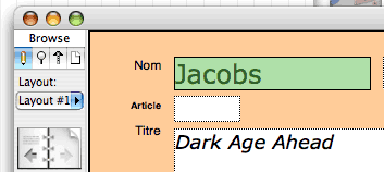
In this screen shot, the word “Jacobs” is in Verdana 24 pt, it has Quartz font smoothing, and even though the field is selected and the text is therefore highlighted in green, my preferred selection colour (although for some reason FileMaker Pro uses a lighter shade of my actual colour of choice), there are no white smears around the shapes of the characters.
In other words, FileMaker has no trouble rendering text with font smoothing over a darker background colour.
But that’s in regular text fields. FileMaker supports other kinds of field formats, of course, including pop-up menus, pop-up lists, radio buttons, checkbox buttons, etc. And that’s where the true extent of FileMaker’s font smoothing support is revealed:
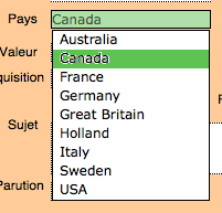
This is a field formatted as a pop-up list. As you can see, while the actual text field is rendered properly (albeit with the lighter shade of my selection colour), the pop-up list items have a problem. They do use font smoothing, but obviously the font smoothing is not handled by the same routines as the ones used for the field itself. When the list items are displayed over a white background, there is no visible problem. But as soon as you select an item in the list, FileMaker highlights the selection with the normal selection colour (not the lighter shade this time) and… the ugly white smears around the shapes of the characters are back.
The problem is undoubtedly related to the fact that, instead of using standard Mac OS X Aqua controls, FileMaker uses its own proprietary interface controls. (The radio buttons and checkboxes don’t look anything like regular Aqua radio buttons and checkboxes either.) FileMaker has always used proprietary controls, presumably as a way to ensure cross-platform compatibility (so that databases designed with the Macintosh version of FileMaker look the same when opened with the Windows version of it).
But that’s not an excuse. FileMaker also uses its own proprietary code for drawing regular text fields, and, as we’ve seen, these regular text fields do not suffer from the same problem with font smoothing.
It’s just sloppy programming, and I am pretty sure that the reasoning here is that this is something that occurs only while you are selecting an item in a pop-up list, so it’s probably considered a “minor” inconvenience and left forever at the bottom of the “to-do” list. Unfortunately, it might be minor with the default pale blue selection colour in Mac OS X, but it’s far from minor with a darker selection colour such as my dark green. It really does affect the text’s legibility.
And the problem is not limited to pop-up lists. It also occurs in various other dialog boxes in FileMaker. The following is a shot of the “Part Setup” dialog box:
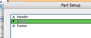
You can also see the same kind of thing in the “ScriptMaker” dialog box, in the “Sort” dialog box, etc.
FileMaker is an expensive application, and when you pay a significant amount of money, you expect some level of quality in your software. I am afraid that, when it comes to anti-aliasing support, FileMaker’s quality is simply unacceptable.