PowerPoint 2004: Very poor interface for paragraph spacing
Posted by Pierre Igot in: MicrosoftNovember 17th, 2004 • 5:33 am
This is a typical example of how atrocious PowerPoint’s interface is, and the very real impact that the poor interface has on office workers in their daily work.
I am referring here to the tools provided by the PowerPoint interface to create space between paragraphs of text and, more specifically, between list items in a bullet list.
Bullet lists are a very, very common format used by many PowerPoint users when they create presentations. So you’d think it would be a priority for Microsoft to get the interface for formatting bullet lists right. Think again.
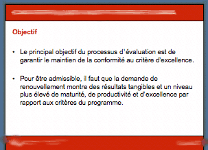
Quite often in my work, I receive PowerPoint presentations with slides containing bullet lists, like the following:

As you can see in this picture, the bullet list only includes two items, and obviously the creator of this slide wanted to create some space between the two bullets, in order to separate them more visually and fill the space in the slide.
The logical thing to do here would be to apply some “space after” to the bullet list items, each of which is a paragraph (not a single-line list item). In Word 2004, you can use the “Space after” and “Space before” to create space between paragraphs. The option is there, even though it’s far too difficult to access in the standard Word interface.
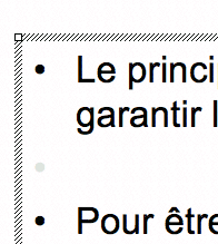
But if I look closely at how the creator of this slide created this space between the bullet list items, here is what I find:

There you go. Obviously, the creator of the slide used the good old trick of inserting an empty paragraph (in that case, an empty list item) between the two existing items. Fortunately for him, when a list item is empty, PowerPoint does not display the bullet symbol. (It appears in pale grey in the picture above because PowerPoint shows it while editing slides, but it doesn’t actually become visible until you type something in the paragraph.)
Of course, this works for creating space between list items in PowerPoint slides, but it’s a very crude approach. And it’s particularly annoying when you have to edit a slide created by someone else, and your changes end up changing the flow of the text and there is no longer enough room on the slide for all the bullet list items, including the empty ones.
The question here is: Why did the creator of this slide not use the “proper” way of adding space between list items? Well, it’s simply because the interface for it is so atrocious.
First of all, the feature is not included in the Formatting Palette. There is a control for “Paragraph Spacing” in the Formatting Palette, but it’s actually an option that changes the line spacing between lines in paragraphs — which makes it completely useless when you are trying to add space between list items. The fact that it’s called “Paragraph Spacing” is totally absurd, especially in light of the fact that the command for creating space between paragraphs, which is not in the Formatting Palette and is only accessible through the “” menu is called… ““.
Can you believe this? What is called “Paragraph Spacing” actually changes the line spacing within paragraphs, and paragraph spacing is found under a command called ““. It boggles the mind.
Obviously the number of PowerPoint users who’ve actually figured this mess out is very small. Most are probably not even aware that the “” command exists, let alone that it actually lets the user change paragraph spacing options…
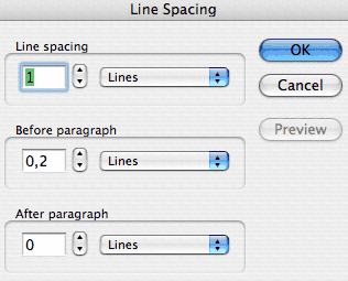
So, why on earth are the paragraph spacing options under a command called ““? Well, because the “Line Spacing” dialog box actually includes both line spacing and paragraph spacing options:

The dialog box does not actually use the words “paragraph spacing” (ostensibly because they are used to describe the line spacing options in the Formatting Palette), but that’s what the second and third settings are (“Before paragraph” and “After paragraph“).
And these settings actually work for creating space between bullet list items!
(I will not dwell on the shortcomings of the “Line Spacing” dialog box itself, including the fact that the option heading before each option is placed too close to the area with the controls, or that you actually have to click on a “Preview” button to see your changes, even though it wouldn’t have cost Microsoft anything to make this preview automatic. I have had enough for today.)
Is it any surprise that, in all the PowerPoint presentations that I have received over the years, not a single one has ever made use of this paragraph spacing option to create space between bullet list items? Of course not.
Is it any surprise that this atrocious interface has remained unchanged for many years, even though bullet lists are one of the most common formatting tool used in PowerPoint presentations? Of course not.
This is Microsoft we are talking about here.
November 20th, 2004 at Nov 20, 04 | 8:11 am
I am afraid I have to admit that, before today, I hadn’t even try the new Notebook Layout in Word. I have absolutely no need for it myself, and I am not aware of any of my tech support customers having a need for it either. As well, I had every reason to be suspicious of it, and it seems that my suspicions were well founded.
Based on a quick review of the situation, it does look like it’s complete impossible to customize the toolbar/palette environment in that particular view mode. Word even hides the “Customize Toolbar” command that I’ve included in my own “Macros” menu! It also hides all kinds of other menu commands in the other regular Word menus.
As usual, the MacBU knows exactly what we want, and we have no say in the matter. I must say, with each new version of the software, they seem to be striving to be reaching new heights in user hostility. So now we have “view modes” that cause a complete change of the menu contents as well. Oh dear. That’s stretching the concept of a “view mode” quite a bit, isn’t it?
Anyhow, I am afraid I don’t see anything that might help you here. The Notebook Layout mode is pretty rigid, and it’s a case of “take it or leave it”, I guess.
As for PowerPoint, I agree with you. “A long time ago” was something like 10 or 15 years ago, and it’s quite telling that Microsoft has decided that user familiarity over such a long period of time is more important that consistent terminology or consistency across Office applications — especially, as you say, in light of the fact that no one actually uses the features in the first place. I guess it’s those famous “users” that Microsoft propaganda claims the company is listening to. No one has ever met one of them, but apparently they are in control :).
November 19th, 2004 at Nov 19, 04 | 6:20 pm
Here’s something worse than the situation in PowerPoint: can you figure out how to control paragraphs in the new Note View mode in Word? The paragraph line spacing and style controls are apparently hidden by design; one has to go to the normal or page layout view to edit the settings and then switch back to the Note View. I’m amazed. It is an excellent example of the fine testing procedures and a keen use of opportunity cost at the MacBU.
The Note View does provide an excellent outliner for general use in note taking and organizing ideas, but it is bogus how one has to work around the interface to get the work done.
By the way, I would appreciate any insight you have about how one can get user-designed palletes to be visible in the Note View. I haven’t figured it out yet.
With respect to PowerPoint, I guess that the paragraph controls were wrongly named a long time ago and won’t be changed by MS because it would confuse long-time users. But the long-time users probably don’t know about these controls, as you point out.
November 20th, 2004 at Nov 20, 04 | 9:32 am
Well, I’m afraid that these “users” are probably the same ones that chose W for president down here in the States. :-) There’s no accounting for taste or for rationality anymore, what’s important is to know you are doing the right thing no matter what the facts say. This applies to politics as well as to software design, it seems.
Back to the Notebook Layout view (the proper terminology, sorry for the incorrect terminology that I used above). It turns out that MS has provided some prepared styles with the name indicating its special use in the Notebook Layout view, for outline levels and for the header/title area. While in the Page Layout or Normal view, one can edit these styles using the standard techniques. They can even be used without difficulty in these views. Upon switching back to the Notebook Layout view, one can use the outline level styles by tabbing or by using the formatting pallet. I was able to make some modifications to the prepared styles that suited my work well, and overall I am rather pleased with the results.
I wish that the MacBU would provide a consistent user interface for its tools; surely it would be sufficient to have a preference check-box that could be shipped in the “off” position if the “users” prefer not to have the controls active out of the box. I guess it is time to email Rick Schaut about this one.
November 23rd, 2004 at Nov 23, 04 | 1:22 am
I think I’d rather not discuss the issue of “W users” right here :). I don’t know if it’s a perfect analogy, but there’s definitely something dispiriting about the lack of accountability at all levels.
Glad you found a work-around to customize the appearance of text in the Notebook Layout view mode. Should have thought of that myself.
As for expecting Microsoft products to have a consistent user interface, well, that’s way up there with finding the Holy Grail or getting North Americans to reduce their oil consumption. Good luck with that! ;-)