Excel 2004: Text alignment buttons in Formatting Palette still misleading when selection is mixed
Posted by Pierre Igot in: MacintoshAugust 20th, 2004 • 3:49 am
The Formatting Palette in Excel 2004 is similar to the one in Word 2004, but leave it to Microsoft to manage to introduce inconsistency even in such a simple thing as text alignment buttons.
Like Word’s Formatting Palette, Excel’s Formatting Palette has buttons (under “Alignment and Spacing“) that can be used to align text horizontally in spreadsheet rows. It has the traditional four buttons: Align Left, Align Center, Align Right, and Justify.
Typically, these buttons also act as status indicators. In other words, they’ll be used by Excel to indicate the text alignment settings of the current selection. If the currently selected cell is left-aligned, then the Align Left button will have a dark grey shade to indicate that it is “depressed”. If the currently selected cell is centered, then the Align Center button will be depressed. Etc.
But what happens when the current selection consists of several cells whose text alignment settings are not all the same? Obviously in such a situation the buttons can no longer be used as status indicators — or at least not easily.
In such a situation, Word 2004 has at least the humility not to display anything at all. None of the Formatting Palette buttons for text alignment look depressed.
Excel 2004, on the other hand, adopts a different approach. For example, if the selection consists of one cell that’s left-aligned and one cell that’s centered, then the behaviour of the Formatting Palette buttons will be as follows. When you select several cells in Excel, there’s always a “primary” cell in the selection, which is the one that was clicked on first when you created the selection. In the picture below, for example, two cells are selected and the primary cell is the top one:
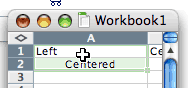
What Excel does regarding the text alignment status indicators for such a selection is that it uses the text alignment setting of the primary cell in the selection. In the picture above, consequently, since the text in the primary cell is left-aligned, then the Align Left button will look depressed in the Formatting Palette.
If I had created the same selection by clicking on the bottom cell first and dragging my mouse pointer upwards, then the primary cell would have been the bottom one, and the Align Center button would have been the depressed one in the Formatting Palette.
I guess there is some logic to this — but the problem remains: since the text alignment buttons apply to all the cells in the selection, their status should correspond to the text alignment status of all the cells in the selection, and not just the primary cell. And then there is the fact that the exact same buttons in Word 2004 do not behave in the same way, creating yet more inconsistency across Mac OS X applications.
Finally, this is such a common situation (having a mixed selection) that you’d think that, by now, software developers would have come up with a way to reflect the “mixed” status of the selection. After all, even in the classic Mac OS, we had the three different states for the checkbox button: checked (checkmark), unchecked (no checkmark), and mixed (dash). This is something that Microsoft supports in its “Paragraph…” dialog box for example, for formatting options that appear as checkboxes, such as the “Keep with next” and “Keep lines together” options.
So it’s nothing new. I realize that things are a bit trickier with toolbar buttons than they are with checkboxes, but still… One could easily imagine, for example, a “half depressed” state for buttons that would be used to reflect the status of a mixed selection.
Do not expect such innovation from Microsoft, though. It already took them years to get even the checkbox thing right.