InDesign CS: Interface inconsistency for flipping objects
Posted by Pierre Igot in: MacintoshMarch 11th, 2004 • 1:32 am
Here’s another example of how, in spite of its maturity and polished appearance, Adobe’s InDesign CS fails to meet some pretty basic user interface requirements.
The other day, I was editing a document and needed to flip a placed object horizontally. (Flipping produces the mirror image of an object, while rotating by 180 degrees preserves the vertical and horizontal orientation of the object.)
I spent a good five minutes exploring the “Object” menu in InDesign in order to find the “Flip Horizontal” and “Flip Vertical” commands. This menu is the natural place for such commands. More specifically, its first item is a “Transform…” submenu that gives you access to commands for rotating, moving, etc. But there is no command for “flipping”.
I figured that it was just a terminology issue and that Adobe probably put the flipping commands under “Rotate…”, so I invoked that command. But here’s what I got:
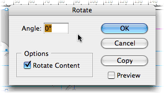
No sign of flipping commands in there!
I looked through the entire “Object” menu, but couldn’t find anything elsewhere in that menu either. I ended up invoking InDesign CS’s Help feature, which is web-based rather than Help Viewer-based. And I used the built-in search tool to search for “flip”. And that’s when I finally discovered that you actually have to use the contextual menu in the Control palette!
Indeed, for some reason, that contextual menu contains another mix of object transformation commands, which this time includes “Flip Horizontal” and “Flip Vertical”:
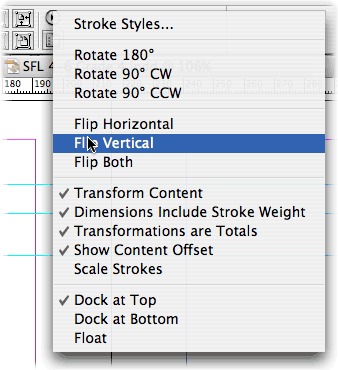
Now, I have no problems with presenting InDesign CS’s feature set for object transformation in a different way in the Control palette. But does it really make sense that the Control palette is the only way to access the “Flip Vertical” and “Flip Horizontal” commands? Why aren’t they accessible through the “Object” menu as well?
One of the fundamental principles governing a graphical user interface is that you should provide the user with several different ways of doing the same thing when these several different ways have an equivalent level of intuitiveness and convenience. When a program has an “Object” menu with a list of commands intended for manipulating objects, including commands for rotating objects, it is normal that the user would expect to also find commands for flipping objects in that same menu.
Especially in a page layout program, flipping objects is something that the user is just as likely to do as rotating them. There is therefore no reason that, in InDesign CS, the rotating commands should be accessible through both the “Object” menu and through the Control palette, while the commands for flipping objects are only accessible through the Control palette.
Yes, it’s a small issue, but it’s far from being insignificant. And this sort of inconsistency is a sign that Adobe are not paying as much attention to UI design as they should.
March 11th, 2004 at Mar 11, 04 | 4:25 am
Pierre:
I finally got a copy of InDesign CS and I expect I’ll be visiting areas like this one in the near future. Thanks for the heads-up about “flip”.
I’ve been scratching my head about the apparent UI philosophies of Mac versus Windows for quite some time. Seems to me that Windows much more frequently implements multiple paths to a function, apparently with the idea that this accomodates users who find the way that best suits them. By contrast, on Mac, designers generally work hard to find the single “best” way, guided by Apple’s rules.
Let me re-label these approaches: “democratic” versus “elitist”. (Philosophically, I firmly believe in the former; in practice, as regards a UI, I much prefer the latter.)
Of course, these are generalizations and we don’t have to look far to find exceptions.
In the case you discuss, it appears someone traded off clutter in the second-best candidate for locating these functions for the difficulty of actually locating them in the Control palette (which, by the way, I have yet to locate). Was that the best choice? Well, I would rather a designer choose, risking an error, than cluttering multiple locations.
Ultimately, I expect menus will be dynamically configured per-user, based on recent history and current content. If done well, the function we need will simply be close-at-hand. If not, well, we know about _that_ all to well already.
Henry
March 11th, 2004 at Mar 11, 04 | 8:36 am
The Control palette, like all palettes, doesn’t have a title bar that’s big enough to display its name. But it’s treated as any other window in InDesign and is listed in the “Window” menu. It’s the horizontal palette that normally appears right underneath the menu bar. The added difficulty is that it’s a palette whose content is completely context-dependent and changes all the time (character/paragraph formatting tools when text is selected, object transformation tools when an object is selected, etc.).
And then there is the fact that the “Flip” commands are tucked away in the contextual menu, that Adobe-specific UI thing that consists of a round blob with a right-pointing black triangle. This thing is everywhere (every palette has one), and often contains very important features that cannot be accessed anywhere else!
For example, I find it frustrating that I always have to go to this menu (or use the keyboard shortcut) when I want to make a change to the “Keep” options (when working with text). My 23″ screen could easily accommodate many more controls in the Control palette itself, instead of forcing me to access a contextual menu. And there’s no way to customize the Control palette so that it displays more stuff if there is room for it. (There’s all that dead space on the right-hand side of the Control palette that’s not used for anything.)
I guess the solution here is to change the keyboard shortcut for invoking the “Keep” options to a shortcut that only requires one hand, so that the other hand can stay on the mouse.
As for the issue of the “Flip” commands, it wouldn’t be so bad if, again, the Control palette included them directly rather than through this menu thing. But I still believe that it doesn’t make sense not to include them in the “Transform” submenu. It’s a pretty common transformation, and it doesn’t exactly increase clutter, since it’s only a submenu.
March 18th, 2004 at Mar 18, 04 | 2:33 am
It was much quicker for me to find how to flip horizontally on your site than within InDesign. That’s pretty disconcerting.
March 18th, 2004 at Mar 18, 04 | 3:28 am
Discouraging, even! To Adobe’s credit, the Help feature works reasonably well and the index is quite comprehensive… but people shouldn’t even have to go to the Help feature for such fundamental things.
June 23rd, 2004 at Jun 23, 04 | 8:59 pm
Thanks for this page, I was desperately looking for the flipping command. Despite these things, Adobe deserves some positive criticism because of their advanced exporting and edit-copy options in relation to illustrator and photoshop.
June 23rd, 2004 at Jun 23, 04 | 10:11 pm
Proper integration with Illustrator and Photoshop is really a minimum requirement :-). Fully compliance with Mac OS X interface standards is another one, and unfortunately in that department Adobe applications are somewhat lacking.
June 24th, 2004 at Jun 24, 04 | 2:31 am
The UI is merely a veneer over the actual mechanisms of these programs. In the scheme of things, virtually trivial, and –if my past experience is still valid– heavily supported by standardized programming interfaces provided by Apple. It takes a bit of work by the application programmers to implement some special UI scheme, but not necessarily very much.
Inasmuch as these major programs don’t really change very much from version to version, what we see most often with respect to UI changes is very much simply “noise” subject to the whims of marketing departments, who can make arbitrary changes to suit their needs. Compare supermarket products: “New! Improved Package. Same ingredients.”
From my point of view, stability is important, so once I learn how to find a particular feature, I can find it again. When customization is supported by sufficiently transparent mechanisms, I’ll consider customizing, but not otherwise.
I also depend on “availability” in the sense that once can traverse most of the functionality by following a reasonably direct path through menu options. That’s how I learn most programs: by looking around. (How else?) Operations available only through odd key combintions or obscure menus… I’ll miss. Obviously, if a function is basic enough, I’ll consult help or other documentation to discover its location.
June 24th, 2004 at Jun 24, 04 | 3:13 am
Let’s take a simple example: In Illustrator CS, the “Print” dialog box has a row of buttons at the bottom. The right-most button is “Done” and is not the default button. The default button is “Print” (as expected), but it’s not the right-most button. It is the button next to “Done”, on the left.
I honestly don’t think that this is due to any interference by the marketing department. Obviously someone in the software design team itself decided that this made more sense than to put the default “Print” button in the bottom-right corner, where users expect it to be. Why? Because most of the adjustments that are normally done in the “Page Setup” dialog box in other programs are actually done in the “Print” dialog box in Illustrator. So of course you’ll need to go to the “Print” dialog long before you actually want to print your document. The “Done” button is for that: it’s to use the “Print” dialog for page setup purposes.
But the core issue — why is the page setup stuff done in the “Print” dialog box — is a software design issue, that probably has nothing to do with marketing or other “outside” forces. (I highly doubt that doing the page setup stuff in the “Print” dialog can be used as a marketing point.) It is an example that shows quite clearly that Adobe engineers don’t really value intuitiveness and consistency as highly as we do.
June 24th, 2004 at Jun 24, 04 | 4:46 am
I think probably the issue is this: UI design for intuitiveness and consistency (UI I+C) is a second- or third-order issue for many (most?) software vendors.
I think marketing is an anti-design force. “Just get feature ‘x’ in, don’t worry about the details.”
Modifications for the next version are on a prioritized list, from which they are handed out more or less mechanically to software engineers, who are rewarded for their speed of implementing the change and possibly for the long-term quality (read: lack of bugs) in the implementation.
There’s probably very little evaluation for UI I+C, I’d guess mostly because there is no easy way to measure performance in this regard, either within a company, or generally in the marketplace.
Technically, the core issue you mention _is_ a UI design issue. The software engineering is minimal, no matter where the print setup is done. The code that actually does the printing doesn’t “know” or care where the printing parameters are set. The people who do the UI software and the people who do the printing code may never communicate with each other except through formal specifications.
I’m guessing that such decisions as you mention are most often done in isolation by individuals. In your extensive correspondence with vendors and your monitoring of information sources, can you recall any cases in which someone said, “we referred the issue to the UI Design Committee” or something similar? I can’t, and I’m guessing that, outside a small group in Apple, these simply don’t exist. (There’s a guy up the street who works for Apple; next time I see him, I’ll see what he can find out on this point.)
Overall, I don’t think there is any great hope for improvement in UI I+C without the advent of some entirely new paradigm for personal computing. You may be able to effect changes in individual cases… I think many of us who feel as you do will simply be forced to adapt. Sigh.