Mac OS X: Mail ugliness
Posted by Pierre Igot in: MacintoshAugust 29th, 2003 • 5:13 pm
If you have more than one email account and you are using Mac OS X’s Mail application, you can probably reproduce the following.
Compose a new message. This opens a new window, with the “To:” field highlighted using the “blue halo” effect.
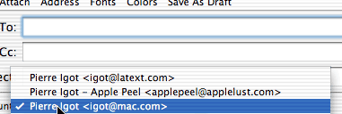
Now go to the “Account:” pop-up menu to SELECT a different account to send the message from:

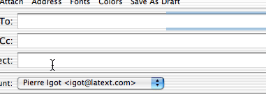
Select the new account and release the mouse button. Now look at the “blue halo” effect around the “To:” field:

Not pretty. Apple doesn’t even have the excuse of it being a defective “image refresh” mechanism, since at no point was the email account pop-up menu covering the blue halo, as my pictures SHOW quite clearly.
It’s purely cosmetic, and I am not losing any sleep over it, but it still is symptomatic of Mac OS X’s less-than-polished aspects.
I’ll be curious to see if this particular glitch is fixed in Mac OS X 10.3
September 5th, 2003 at Sep 05, 03 | 1:49 pm
You are too impatient: just wait c. 10 seconds and see what happens! (Still a bug, though)
September 5th, 2003 at Sep 05, 03 | 5:16 pm
Right you are :). I would never wait that long for something to refresh, though! :)
September 5th, 2003 at Sep 05, 03 | 7:06 pm
If I compose a new message I’m tabbing my way from the top field (=”To:”) downwards to the “Account” field. So, I never see this halo anomalia. This works because I’ve selected “access all controls in the current dialog” in the keyboard prefpane.