iTunes 10: About the vertically aligned window controls
Posted by Pierre Igot in: iTunesSeptember 4th, 2010 • 1:14 pm
By now, most iTunes users probably have downloaded and installed iTunes 10 and have been introduced to what Ars Technica calls “the cringe-inducing vertically aligned window controls”:
As Ars Technica writer Chris Foresman notes, these vertically-aligned controls are used in conjunction with the removal of the actual title bar of iTunes’s main window to “save a few pixels of vertical space.” I agree with Chris that “a few pixels of vertical space isn’t a compelling enough reason” to justify this change.
Thankfully, Chris is kind enough to provide us with a way to revert to the previous window style, with a Terminal command. Quit iTunes 10, bring up the Terminal, enter:
defaults write com.apple.iTunes full-window -1
and relaunch iTunes. Now you have a title bar again (with “iTunes” as the title in the middle) and the window controls are back to their normal horizontal orientation.
There are a couple of things that Ars Technica fails to mention, however.
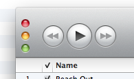
The first one is that this new “style” isn’t actually new. iTunes already used it in previous versions. But it only used it for the minimized version of the main iTunes window, obtained by clicking on the green control:

In that context, it sort of made sense and wasn’t as cringe-inducing, because here was indeed a special type of window with no title bar and the whole point of the minimization was to provide access to as many controls as possible through a small window. So the window control style didn’t really shock anyone and has been with us for years.
But in the regular iTunes window, it is a different matter altogether, precisely because the non-minimized main iTunes window is a regular window and is expected to look like other regular Mac OS X windows. Just because there are no “document windows” in iTunes and the application tends to be used in a single-window interface, like iPhoto, iMovie, and other similar document-less applications, it does not mean that the window style should be different. It is both confusing and frankly, not very elegant.
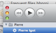
This brings me to the other thing not mentioned in the Ars Technica article. While iTunes is indeed not a document-based application, it is possible to have multiple windows open in iTunes. Just double-click on the icon of any playlist or even the iTunes Store in the source list on the left of the main window.
This will open what you double-clicked on in a separate window and, guess what, that window has a title bar, which makes the vertical window controls look even sillier and uglier, because they are not even tucked in the corner of the window any more:
In those windows, not a single pixel of vertical space is saved, and the vertical controls look completely out of place. What’s next? iTunes 11 with built-in traffic lights?
I for one use separate windows for specific playlists and for the iTunes Store in iTunes all the time. I know that iTunes is not really intended to be used like this, but the software supports it, so it has to be taken into account when new design decisions are made for the user interface of the application.
It does not look to me like Apple’s engineers took any of this into account when they made this rather silly decision. Here’s hoping that they’ll come to their senses and change the style back in iTunes 11. If not, we might even end up with the same thing in iPhoto and other single-window applications. Yuk.
March 4th, 2011 at Mar 04, 11 | 4:51 pm
[…] (2010-09-06): Pierre Igot: While iTunes is indeed not a document-based application, it is possible to have multiple windows […]