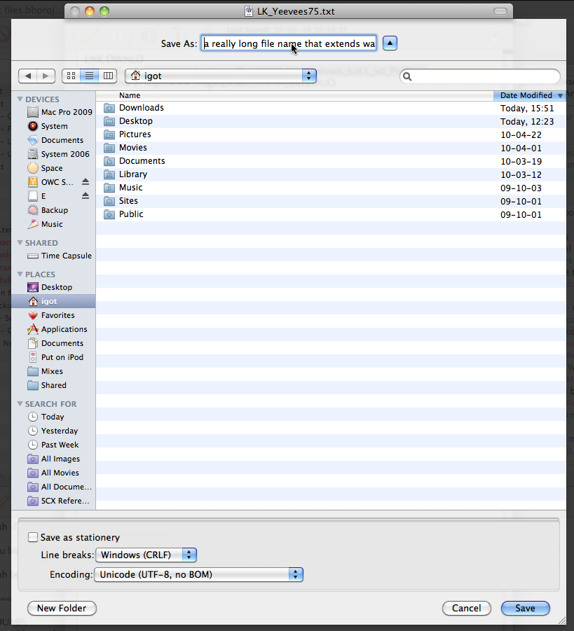
‘Save’ dialog in Mac OS X: Needs resizable ‘Save As:’ field
Posted by Pierre Igot in: MacintoshApril 27th, 2010 • 4:27 pm

What is wrong with this picture? To me, it’s quite obvious. It’s the fact that, after all these years, the “Save As:” field where the user is supposed to enter the file name is still limited to a width of something like 250 pixels, and that there is no obvious way to handle file names that extend beyond that limited width, i.e. whose number of characters exceeds the 40 or so limit visually imposed by this fixed-width input field.
I believe that the above picture makes it quite obvious that, when the “Save As:” dialog is resized so that more information can be displayed within the main area, there is an enormous waste of screen real estate on both sides of the “Save As:” text field.
And yet, for many years now, Mac OS X has had full support for very long file names, and it is very easy to come up with a file name whose length exceeds 40 characters when you want to include a decent amount of information in that file name (not to mention the fact that, when file extensions are visible, several of these 40 characters are taken up by the file extension itself).
It is also far from obvious here that, in spite of the width limitation, you can enter longer file names. You just need to get used to the fact that scrolling within such a limited text field involves attempting to move the insertion point or extend the selection beyond the visible area of the field using text navigation shortcuts.
It’s not intuitive, it’s clumsy and there is really no reason why Apple cannot make it so that the “Save As:” text field itself is also automatically resized when the entire dialog box is resized.
The very existence of resizable text input areas in Safari shows that Apple’s engineers are aware of the frustrations associated with entering a fairly large amount of text in a text input field of limited width and height:

If such flexibility is warranted and recommended for web forms in Safari, why does it not apply to Mac OS X’s own dialog boxes?
I know that Apple is far from alone in this failure to provide flexible user interfaces for text input. Such fixed-width text input fields can be found everywhere in Mac OS X applications and, indeed, in all kinds of on-line web-based user interfaces. But that’s often because these interfaces are designed by lousy designers. Apple, on the other hand, is supposed to have highly skilled designers. They are precisely the ones who came up with the resizable text input areas in web forms in Safari as a way to work around the limitations of the lousy non-scalable interfaces provided by so many web designers out there. Apple’s engineers would be well advised to devote a bit more thought and resources to adapting their own user interfaces to a widening range of display sizes.
I also know that having large displays where dialog boxes can be resized to such a large width and height is a privilege. But that does not mean that those who have that privilege do not want to be able to enjoy the full benefits of the extra space.
Granted, these days Apple’s attention seems to be mostly focused on interfaces for small displays such as the iPhone’s or the iPad’s. But if Steve Jobs really wants to reassure “ordinary” Mac users that Mac OS X and Mac hardware are not being neglected, he might want to encourage his developers and designers to continue to enhance the user experience for people with larger displays.
I submitted an enhancement request via Bug Reporter about this fixed-width “Save As:” text input field many years ago. I never heard back from anyone about it (not surprising) and I am still waiting to see such an enhancement implemented.
Not only should the width of the text field vary depending on the overall width of the dialog box, but the text field should also have a small control on the right to indicate that it’s resizable. Or even if they don’t want to clutter the dialog with more controls, they could at least create a small area next to the field where the cursor changes to an icon indicating that the edge of the field can be dragged to resize the field, similar to the one you get in Safari between the address field and the Google search field:

At least some kind of improvement would really be appreciated here.