iTunes 9: About that new ‘Playlist’ screen
Posted by Pierre Igot in: iTunesSeptember 18th, 2009 • 9:51 am
There is simplifying and streamlining, and then there is dumbing down. I am afraid that, with this latest “improvement” in iTunes 9, Apple’s engineers have crossed the line:
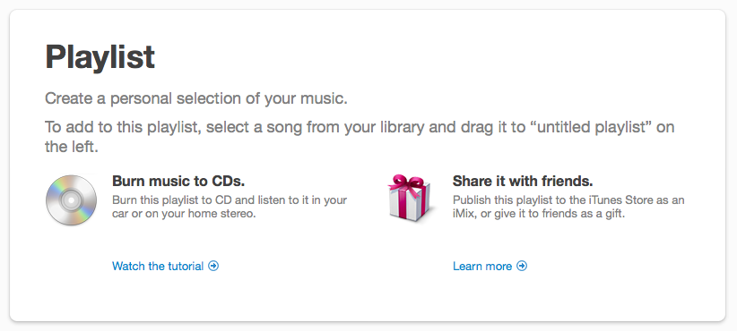
This is what you get on your screen each and every time you create a new empty playlist. As if all iTunes users with a moderate level of experience needed to be reminded each and every time they create an empty playlist what a playlist is for and how it works.
Worse still, the content of the window is clumsy and incomplete.
First, since the text contains a reference to the way the playlist appears “on the left,” i.e. in the source list, by default the name of the playlist referred to is “untitled playlist.” If you are going to dumb things down, is it really such a good idea to phrase things in a manner that seems to imply that “untitled playlist” is a perfectly good playlist name? Shouldn’t the first step here be to encourage people to give their new playlist a proper name?
Or is Apple assuming that people are dumb enough to need to be told what a playlist is, but smart enough to know that that thing “on the left” with “untitled playlist” highlighted in the selection colour is the playlist’s title and needs to be typed over with a proper name? I mean, if we are going to assume that people are so dumb, shouldn’t this first new playlist screen have some kind of form in big characters explicitly inviting people to name their new playlist before telling them that they can drag stuff onto it?
In addition, the instructions are far from satisfactory. The process described to add a song to the playlist is only one possible approach. It assumes that people only use a single window approach in iTunes and never try to drag and drop stuff from the Finder.
Yet these are two other perfectly valid approaches, and probably just as user-friendly and easy to use as the default one that Apple appears to favour.
If you want to use a multiple window approach in iTunes, you can just double-click on a playlist’s icon in the source list on the left. This opens the playlist in a new, separate window, which you can resize and relocate in order to be able to see both the main iTunes window with your music library and the new playlist that you want to compose.
You can then drag and drop stuff from the main iTunes library window to the playlist window, which is now a much larger target than the single line with the playlist’s name in the source list on the left (and also lets you pick the exact spot in the playlist where you want to insert the track[s] you are dragging).
And then there is the fact that you can also drag and drop files from a Finder window directly to the separate playlist window or, if you are still viewing the playlist in the main iTunes window, to the playlist’s main area on the right itself. This will import the files that you are dragging from the Finder into the iTunes library and directly add them to the target playlist.
I use this approach all the time to import stuff into iTunes, not just because a large playlist window is a much bigger target than a small section of the source list on the left, especially when you are dragging stuff from another application and iTunes is in the background, but also because it enables me to see all the recently imported stuff in a single place, instead of trying to locate it within the main iTunes library after I’ve imported it.
Because of this, I always have at least two or three “temporary” playlists open in separate windows in iTunes in addition to the main iTunes window. And when these other temporary playlists are empty, they look like this:

This is the way a new playlist used to look in iTunes before version 9. But now, each time I quit iTunes after leaving such a separate window open with an empty playlist, when I relaunch iTunes, instead of showing me the same empty playlist, iTunes switches back to that stupid screen illustrated above, which does not even look like something you can drag and drop stuff onto…
It is, granted, a minor irritant, but it’s an irritant just the same. It makes Apple’s software feel very Microsoftian indeed, and that’s not a compliment. To me, this type of dumbed-down behaviour that assumes the worst is just as irritating as the myriad of everyday bugs and interface flaws that one encounters in every software-based device, from one’s PVR to one’s microwave oven and one’s car. It affects the usability of the software/interface/system, because it is so damn distracting, and seems to be impossible to get used to. You end up tolerating it, living with it, because you don’t like it, and you never will.
I guess I am in a foul mood this morning.
October 19th, 2009 at Oct 19, 09 | 4:37 pm
[…] 19, 2009 by chimac Read more here. I see his point. I’m not sure that most people are as passionate about him about […]