Word 2008: The new ‘Preferences’ dialog
Posted by Pierre Igot in: MicrosoftJanuary 25th, 2008 • 5:26 pm
They say imitation is the sincerest form of flattery. In the case of Microsoft, I’d say imitation is the best way to show the limits of your own competence.
Let’s take a quick look at the new “Preferences” dialog box in Word 2008 and the Mac OS X feature that is the most obvious inspiration for it, i.e. Mac OS X’s own System Preferences tool.
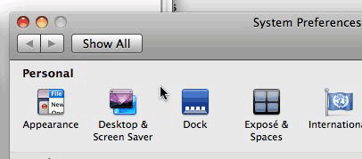
Here’s what the top-left corner of the System Preferences window looks like:
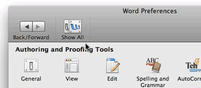
And here’s what the top-left corner of Word 2008’s “Preferences” dialog looks like:
Looks pretty similar, doesn’t it?
Yet this simple comparison makes it quite obvious that Microsoft’s engineers are simply unable to truly comprehend what makes a decent, proper Mac OS X application.
Let’s review the issues.
First of all, there is the fact that this window does not have buttons in the top-left corner of the title bar. This is obviously because the preferences window is actually a modal dialog box rather than a window. But the thing is that in most other Mac OS X applications, the preferences window is no longer a modal dialog box, but rather a window that can stay open in the background. Here’s the Pages preferences window, for example:
It has a toolbar, but it also has the three buttons in the title bar—although the only active one is the close button, since this window cannot be minimized or maximized. This appears to have become the standard for most Mac OS X applications. The only common Mac OS X application that I could find that has a modal dialog box is iTunes, but even there, the look is decidedly different, with only the skinny solid title bar and then a different-looking toolbar:

But anyway, I don’t think iTunes could be used as a model here, because it is quite clearly an exception to the rule of having a non-modal preferences window.
Because Microsoft chose to keep their preferences window modal, yet attempted to use as a model a non-modal window with a toolbar, they ended up with this rather weird-looking window which has a unified title bar/toolbar but no title bar buttons.
It is, I believe, a unique situation in Mac OS X. There is no other Mac OS X application (Apple or third-party) that uses this look. Why did Microsoft get this weird look? Because their changes were only skin-deep, and they chose a visual model (the System Preferences window) that is not applicable to the type of interface (a modal dialog box) that they insisted on keeping. In other words, they chose the wrong visual model.
Of course, if Microsoft had really meant to improve things and achieve a more Mac-like UI, they would actually have embraced the non-modal model used by Pages and other Mac OS X, with a non-modal preferences window with title bar buttons that could stay open in the background. It would actually have made more sense since, as indicated in another post last week, their application preferences window actually still contains document-specific settings that would be more appropriate for an inspector type of window! (Not that I am endorsing this on-going aberration in any way, mind you.)
But no, they chose to maintain the old modal approach, and chose the wrong visual model for it, which resulted in this totally non-standard look.
Then there is the issue of the actual contents of the window’s toolbar.
First of all, it does not behave like a standard Mac OS X toolbar in that you do not have the option to switch between various options by command-clicking on the toolbar toggle button in the right-hand side of the title bar. In fact, the button is not even there! So you cannot change the visual appearance of the toolbar at all. You cannot switch to a display without the button labels, or with smaller icons.
And yet, as the comparison with System Preferences shows, the text labels for the buttons are actually quite unnecessary. If Microsoft were going to use System Preferences as a model, why didn’t they use the exact same controls, i.e. the Back/Forward buttons without text label, and a button clearly labelled “Show All” in the button design itself?
Instead they chose to use text labels, and the “Back/Forward” label is not even properly aligned with the two buttons that it corresponds to. The “Forward” part of the label actually starts halfway underneath the “Back” button!
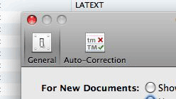
And the “Show All” icon uses a previous-generation design with the switch and a smaller version of the Word application icon which, ironically, is a reduced version of the Word 2004 icon, not the new Word 2008 icon:


What does that tell you about the level of care and attention to detail?
(By the way, I personally find the new Office 2008 icons particularly hideous. They just look like bloated versions of the previous ones. They are fine in bigger sizes, but in the Dock they are really not nice-looking at all. They just look… fat, obese even.)
And finally someone needs to give Microsoft’s developers a quick 5-minute presentation on the purpose of separators in Mac OS X toolbars. They are meant to be used to separate groups of buttons that go together—not individual buttons!
Microsoft itself uses the separators properly in its main toolbar in Word 2008, so why on earth do we have to endure the sight of these useless separators in the toolbar for the preferences dialog?
To me, all these flaws in the Word preferences dialog might be mostly aesthetic and unimportant, but they say a lot about the ability of Microsoft’s developers to really understand what makes a true Mac OS X application. It’s not just a matter of imitating the look of something designed by Apple. It is a matter of using the appropriate look for the appropriate tool, and following the fundamental conventions (explicit or implicit) that apply to this particular look.
In that respect, I am afraid that the new preferences dialog is an utter failure, and just shows that, no matter how hard they try, Microsoft’s MacBU developers don’t really get it. At best, they are able to provide us with a paint job, but without any sign that they actually understand and embrace the underlying design rules that make a true Mac OS X application. On the Mac, design cannot be separated from function. You have to understand the function in order to be able to make the proper design choices. But that’s obviously too much to ask of Microsoft.
January 25th, 2008 at Jan 25, 08 | 6:23 pm
As seperators have been brought up I can not understadn why there is no flexible space seperator included in the customisation options. I thought I would be able to position the toolbar button to toggle the formatting palette on the right hand side of the toolbar but as far as I can see this is not possible in this OS X ‘standard’ toolbar.
January 25th, 2008 at Jan 25, 08 | 11:02 pm
I don’t think the Word 2008 toolbar is in any way a “standard” Mac OS X toolbar. It’s made to look like one, but it’s definitely the same old MS toolbar “technology” underneath. The thing that gives it away is the customization feature, obviously.