Word 2008: Font menu now scrolls at a decent speed
Posted by Pierre Igot in: MicrosoftJanuary 20th, 2008 • 3:24 pm
As an occasional graphic designer and web site developer, I tend to keep a large collection of fonts handy, but I don’t actually feel the need to use a font management utility. So the reality is that, over time, I have ended up accumulating a fairly large number of fonts in my library, and I am too lazy to actually get rid of the ones I don’t use on a regular basis and only activate them when I need them.
This means that, whenever I want to choose a font in a given application, I usually have to scroll through a fairly long list of fonts.
In Word 2004, this was a bit of a pain, because the font menus in that application’s toolbars and in the Formatting Palette were rather slow, regardless of whether you used the WYSIWYG option or not.
With Word 2008, I am pleased to report that, without the WYSIWYG option at least, scrolling up and down the font menu can finally be done at a reasonably high speed, on par with the speed provided in other Mac OS X applications when navigating very long menus.
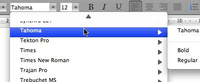
This is undoubtedly related to the fact that this font menu now looks (and therefore behaves) more like a standard Mac OS X menu, rather than some proprietary Microsoft-only control:
The bad news is that Office 2008 still installs a whole bunch of TrueType fonts in your main library folder, and now, because these fonts are stored in a subfolder inside the main library folder called “Microsoft,” you end up with a fair number of duplicates. For example, on my machine, I ended up with both a group of four single-font Verdana files in my main library folder (for roman, bold, italic, and bold italic) and a font suitcase containing the same four font variants (as far as I could tell) inside the “Microsoft” subfolder.
So I had two copies of the same four fonts, and I ended up having to manually trash one of the two sets. The same applied to a number of other TrueType fonts in my main library folder. And since the individual font files and the font suitcases don’t have the same version numbers and the same file sizes, it’s hard to figure out which one you should keep and which one you should trash.
I don’t really care to figure out how this happened, but the fact that it did happen was a bit of a pain. But at least, now that I have cleaned up my fonts folder, I have a font menu in Word 2008 that works reasonably well and is reasonably well organized.
January 21st, 2008 at Jan 21, 08 | 11:32 am
Pierre:
I’m a font minimalist and I value ease-of-switching among a few fonts above a large choice in font menus. In Office 2004, thanks to MS my pared-down font lists unavoidably contain one list of “normal” fonts and a second alphabetized list of 9 “CY” and “CE”- suffixed fonts. Cyrillic and Central European, yes? But I’ve been unable to even find documentation for what function these are SUPPOSED to perform. They’ve never done anything for me except fill up a full 1/3 of my font menu and frustrate my attempts to delete them. I have found hints that including such was a half-baked scheme to support these variant character sets before Apple’s international font support was perfected. Well, OK, but Apple’s font support has improved greatly since 2004 and these fonts are still present — and I’ve never found a way to actually produce even a nice Polish L-stroke in any of them. Oh, and why just Cyrillic and Central European?
Whew! Rant over.
My question: Does Office 2008 eliminate these? Finally?
While I’m on the subject, I’d like to hear what you have to say about the subject of mandatory fonts on Mac. The number seems to be on the increase. Every major app installs its own, with no benefit to many users except (slight) amusement re: the new names we see. Is it only a matter of time before we are required to navigate past Bmzklfrpz and Bmzklfrpz Bold fonts —thanks, Garry Trudeau– to get to Times?
H.
January 21st, 2008 at Jan 21, 08 | 4:53 pm
Answer: Nope. All the CY and CE fonts are still there. I am not even trying to understand what their purpose is. I just ignore them…
Personally, while I don’t like applications installing fonts without my permission, I don’t really mind the choice of fonts. As long as navigating through the fonts is fairly fast (and now with Word 2008 at least that aspect is OK). But fonts should definitely not be required if users don’t want them. Apart from Microsoft Office, however, I haven’t personally encountered many applications that require specific fonts. What other applications did you have in mind?
January 22nd, 2008 at Jan 22, 08 | 11:54 am
Adobe apps, most recently Dreamweaver and Illustrator, new versions of which I installed recently, are the culprits, I think. Also maybe the Adobe Reader. In theory, Adobe keeps their fonts in a Adobe-specific place, not in the usual places, but …
I think one gets new fonts for every major release of MacOS X, not many, but …
About the CY and CE fonts: If we ever needed proof that Office applications receive only cosmetic improvements for each major release, the continued existence of these in the font lists is sufficient.
Aaaarggggh.
Thinking out loud… Is there any significant change from major release-to-release in major applications (or MacOs, for that matter) these days? I think we’ve seen a major slowdown in innovation, companies taking fewer risks and making only incremental changes. Lacing each release with just enough new eye candy and the minimum number of bug fixes to persuade people to buy them… finely calibrated. That’s my impression, anyway. Note also the consolidation: fewer major companies are supplying more and more of the software we use — with the fortunate exception of some free software products.
H.
January 22nd, 2008 at Jan 22, 08 | 1:36 pm
Adobe applications have a bunch of fonts in the “Fonts” folder inside the “Adobe” folder in “Application Support,” but these fonts are only activated within Adobe applications (unless you move them to the more usual places). And I don’t think the applications throw a fit if you remove any of these fonts, so I don’t think that they are “mandatory” in any way.
Personally I am not too concerned about this, simply because we have tons of room on today’s hard drives and OS X does not seem to suffer in terms of performance. But it is true that a greater number of fonts increases the theoretical risk of problems.
As for innovation in general, I agree with your impression. It’s more about small, incremental forward steps (at best). It’s probably a clear sign of our current system showing its limits. Computers are going the way of cars or toasters. It’s too bad, because there really is still a much greater potential for innovation, simply due to the hardware/software dichotomy. It should still be theoretically possible to design “killer applications”—although maybe things have now become too complex for a lone individual to be able to come up with something truly groundbreaking all by himself. I don’t know. I am not a developer :).
January 22nd, 2008 at Jan 22, 08 | 3:24 pm
Right, that’s my impression about how Adobe fonts are supposed to work, but in practice… it did not seem to be so, my font menus in other apps filled up following new installations, and it is too much trouble to sort out. I did what I could with in a few minutes with FontExplorer X …
Yeah, if we totaled the hard disks for us 4 in this house, I think they would account for almost 1TB, an extraordinarily large amount of space. But I’m not so optimistic. I think there are hidden costs to accumulating “stuff” on your hard disk.
As far as the development issues, mainline software development these days is beyond any individual — and apparently beyond many companies, too. The fundamental model these days is an accumulation of all the past work… great for leveraging, terrible for innovation.
Hmmm, progress can’t always be uniform. Maybe we’re just in a temporary lull.
H.