iTunes 7.5: Change in behaviour of iTunes Store links?
Posted by Pierre Igot in: iTunesNovember 24th, 2007 • 5:38 pm
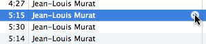
For years (since 4.5), iTunes has had this feature where a little button with an arrow appears next to the track title, artist name, and album title:
In order for this arrow button to appear, you need to have the “Show links to the iTunes Store” option checked in the application’s preferences:
![]()
In previous versions of iTunes, if the option was checked, the button would appear next to each and every track title, artist name, and album title. As of iTunes 7.5, however, the button only appears in the columns for the currently selected track. (I am not sure when exactly Apple made that change.)
The really important thing about this button, however, is that it has a second “internal” function. If you option-click on it, instead of taking you to the iTunes Store, iTunes actually uses the button as an instruction to restrict your current library view to only tracks that match the track title, artist name, or album title.
And in fact there is a hidden option in iTunes’ preferences that lets you invert the behaviour of the buttons so that the internal function is the default one and the iTunes Store function is the one that requires the Option key modifier.
I have been using these buttons with the inverted functions for years now. Since my library contains tens of thousands of tracks, I often need to restrict my library view to only a certain set of tracks, usually all those by a given artist or from a given album. This can also be done with iTunes’ search field, of course, but the arrow buttons are a convenient shortcut for a certain kind of “search.”
However, more recently Apple seems to have made a change that makes the arrow buttons slightly less useful. Normally, when you do a search in iTunes using the search field, if you are using the three-column “Browse” view (with the “Genre,” “Artist,” and “Album” columns in the top half of the library view), then the search results are reflected not just in the track list in the bottom-half of the library view, which only shows the tracks that match the search request. iTunes only updates the contents of the “Genre,” “Artist,” and “Album” columns to reflect the results of the search, i.e. only shows in these columns the values that correspond to the tracks that match the search request.
In other words, if you search for “Jean-Louis Murat” in the search field in iTunes, iTunes shows you all the tracks that have “Jean-Louis Murat” in any of their information tags (track title, artist name, album title, etc.) in the bottom half of the library view. But it also changes the contents of the top half columns, with only the genres, artist names, and album titles from the list of tracks that are the results of the search.
Previously the grey arrow buttons would do the same thing as a search, i.e. they would produce a list of tracks in the bottom half, and then update the contents of the columns in the top half to reflect the list of tracks at the bottom.
Now, however, I find that, after I click on an arrow button, while iTunes still show the list of matching tracks at the bottom and still updates the contents of the “Album” column in the top half to only list the album titles for the tracks in the list of results, it no longer updates the contents of the “Genre” and “Artist” columns to reflect the list of tracks in the bottom half. It still lists all the artists in my library. All it does is that it highlights the artist name in the middle column (the “Artist” column), but it doesn’t even scroll down to that artist name to make it actually visible.
It is a much less useful behaviour, because the “Artist” column can actually be used to view the various artist names that match the underlying Sort Artist name that iTunes actually uses for finding tracks.
I believe this is a bug, but since the primary purpose of the grey arrow links is to sell more tracks at the iTunes Store, I doubt that Apple’s engineers pay much attention to the optional internal behaviour for these links. I’ll still report it as a bug, but it might be a while before we get this functionality back.
November 24th, 2007 at Nov 24, 07 | 8:44 pm
To be honest, I prefer that iTunes just selects the relevant artist name in the artist view rather than filtering the displayed artists. Just as I you do, I dislike, that it doesn’t scroll the list to that name to make the selection visible. That should be considered a bug.
The odd thing here: This may be a bug in some way or another. But I guess when reporting it, you really have to ‘sell’ it well to have a chance of them even taking it seriously. Particularly as the iTunes-internal browsing quite likely is a low priority for Apple as you say.
November 25th, 2007 at Nov 25, 07 | 9:24 am
The reason I preferred the previous behaviour is that (option) clicking on the grey arrow button next to the artist name would actually select tracks whose artist field contained the artist name. So if you had a bunch of different artist names containing the artist in question, for example “XXX featuring YYY,” “XXX featuring ZZZ,” “AAA featuring XXX,” etc., then clicking on the grey arrow would actually show all the tracks by “XXX featuring YYY,” “XXX featuring ZZZ,” “AAA featuring XXX,” etc., with all the different artist names listed in the Artist column in the middle.
Sadly, things no longer work this way. Now clicking on the grey arrow only matches the exact same artist name. It’s not as useful. I’ll have to use the search field instead.
November 26th, 2007 at Nov 26, 07 | 6:50 am
I never used the old functionality so perhaps I’m missing something, but to be honest the way it now works seems right. When searching, it’s obvious how to get back the full unfiltered lists — by clearing the search. With arrow-clicking, it would be much less clear how to return to the full listing.
Of course, it should scroll to the selected artist (or album, if you’ve clicked on an album).
November 26th, 2007 at Nov 26, 07 | 6:51 am
[sorry, continued] … in other words, the way it works now, iTunes takes you to the chosen artist/album in exactly the same way as if you’d navigated there yourself via the browse lists. Which seems right.
November 26th, 2007 at Nov 26, 07 | 9:30 am
It’s a choice between searching for exact matches or for matches within the Artist field. For my use of iTunes, the latter would be preferable. But I suppose it’s a choice (and I can still use the search field, although I then have to retype the artist name, whereas the arrows were a convenient shortcut).
It’s true that the old arrow behaviour was a search behaviour without the name, but I never felt that it was a problem to “exit” that particular search mode. In both cases (i.e. old search with arrows or search field and manual browsing), the basic technique to “exit” the filtered list is to still click on “All” at the top of the top-half columns in Browse view. Which, by the way, could be improved IMO.