Pages 2: Ugly Styles menu in toolbar
Posted by Pierre Igot in: PagesMarch 7th, 2006 • 3:48 pm
I have already discussed the issue of font smoothing styles in Pages in this blog. Pages 2 fails to honour the user’s font smoothing style preference as selected in the “Appearance” system preference pane when rendering text in its document windows and in the WYSIWYG list of styles in the “Styles” drawer that can be shown on the side of a Pages document window.
Unfortunately, this problem also extends to the various “Styles” menus that can be access from the Pages toolbar. (The default “Style” button lists paragraph styles, and you can customize the toolbar by adding two other toolbar buttons for character styles and list styles.)
The styles menus displayed through the toolbar are also WYSIWYG, which means that they also suffer from the same font smoothing issues. With small font sizes, this becomes particular problematic. Take a look at the following screen shot:
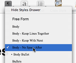
If you find these menu items hard to read and positively ugly, it’s not because of visual artefacts caused by the GIF compression for posting on the web. It actually looks that ugly in real use too. This is for body styles with font values of Times New Roman 11 pt. Nothing particularly unusual! The only menu item that’s actually pleasant to read is the “Hide Styles Drawer” command, which of course is rendered using the default system font. It still doesn’t use subpixel anti-aliasing on LCD displays, but at least it uses a font that’s designed for small sizes and is reasonably legible.
On top of all this, Pages doesn’t even change black to white for the currently highlighted item in the menu, as Mac OS X normally does for menu items (in order to make them easier to read), which make the highlighted menu item almost impossible to read altogether.
I am afraid all this is quite unacceptable. Pages should definitely have an option not to use WYSIWYG Styles menu, because in many situations what you see is positively ugly. It simply is not worthy of a Mac application.
(The Character Styles and List Styles menus are only marginally more tolerable, because they use Helvetica as the underlying font. But if a character style specifies its own font face and font size, the same problem occurs.)
August 9th, 2007 at Aug 09, 07 | 4:13 am
The Pages 3.0 contextual formatting bar is more attractive before you click on anything, but the actual menus that pop up still suffer the same problems.