Anti-Aliasing Hall of Shame: Adobe Illustrator CS2
Posted by Pierre Igot in: Anti-Aliasing Hall of ShameFebruary 13th, 2006 • 11:38 am
I know that Adobe’s products come with their own text rendering engine, which uses its own font smoothing scheme for rendering text in the body of Adobe CS2 documents.
But that’s no excuse not to use Mac OS X’s standard font smoothing scheme when rendering text in user interface items. Yet in that respect, Adobe Illustrator CS2, which came out in 2005, feels like an application from 10 years ago.
This, for example, is the “Character” palette:
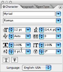
Look at the text in the various fields. It doesn’t even use any font smoothing at all!
There’s absolutely no excuse for this, especially since other Adobe CS2 applications are not affected by the same flaw. Here’s the Character Palette in Adobe InDesign CS2:
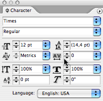
If they can do it properly in InDesign, why can’t they do it in Illustrator?
The only possible conclusion is that, in typical Microsoftian fashion, they don’t care.
And then of course, we get the usual white smears in various places. Here’s an example in the “Preferences” dialog box:
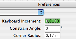
Yuck.
Here again, InDesign has tons of text fields in its own “Preferences” dialog box, and none of them suffer from the same visual flaws when the text is selected.
It’s just pure user interface sloppiness and carelessness. And it comes from one of the major providers of professional-level Macintosh software. It’s absolutely shameful.