iTunes Dashboard widget: More sloppiness
Posted by Pierre Igot in: iTunes, MacintoshJanuary 23rd, 2006 • 11:13 am
Quick memo to Apple engineers: There is still such as thing a “quality control.”
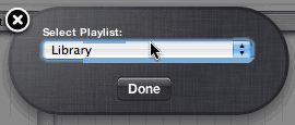
I mean, what the hell is this?

It’s bad enough that Apple’s widgets still do not support full keyboard access and that the blue halo around the pop-up menu serves is completely misleading. Normally, with full keyboard access on, the blue halo serves to indicate which UI item the focus is on. That’s the item that will respond to keyboard input. In the case of a pop-up menu, with full keyboard access on, you can actually pull down the menu by pressing the Space bar, and then select the desired menu item using the Up/Down cursor and the Return key. But of course none of this works here. There might be a blue halo, but the widget doesn’t support full keyboard access and you are obliged to use your mouse if you want to change the setting.
But what’s with the actual drawing of the blue halo? This is terrible. The bottom blue edge is far too thick, except in the first quarter, and there is some blue ugliness inside the pop-up menu control at the top. Ugh.
I tried turning full keyboard access off, and the blue ugliness remains. This is really sloppy on Apple’s part. How many Apple engineers does it take to actually notice such problems during testing and fix them before the product is shipped? Geez.
And I won’t even mention the actual performance of this widget here. In my experience, even on a G5 Quad, the widget is unusable. There are all kinds of delays before the controls start responding when you click on them. And I’ve actually managed to get a state where no music was playing and yet the “Play” button was in “Pause” mode. Good grief.
And some people do wonder if the quality control problems at Apple are just a figment of someone’s imagination. Here’s concrete evidence if you needed any.
February 15th, 2006 at Feb 15, 06 | 9:48 pm
It is quite painfully bad… especially considering the relative simplicity of the application!
February 22nd, 2006 at Feb 22, 06 | 5:17 am
Quality Control Alert!
When you look at the effort Apple have obviously put into things like the ripple effect when launching a widget, it seems exceedingly odd that thay would mess up like this.
By the way, in the spirit of quality control, in your first sentence you have “such as thing as”!
February 22nd, 2006 at Feb 22, 06 | 11:27 am
Oops, thanks for the tip :).