Pages 3.0: Inappropriate tab order for controls in Find/Replace dialog
Posted by Pierre Igot in: PagesOctober 10th, 2007 • 3:29 pm
On my Mac, I always have the Full Keyboard Access (FKA) feature on. This is not because I am disabled or suffering from a repetitive stress injury, but because, as a writer, I spend most of my time with my hands on the keyboard and it is often easier or more efficient to use controls with the keyboard than with the mouse.
And because I am a regular FKA user, I am particularly sensitive to keyboard-related issues and, in particular, to the inconsistencies in support for FKA in various Mac OS X applications, including Apple’s own.
Indeed, it is quite sad to observe that, after all these years, in many cases support for FKA still seems to be an afterthought for Apple’s own developers. (Let’s not even mention Microsoft and Adobe developers here.)
Here is one particularly glaring example that is very much in evidence in the most recent version of Apple’s word processor Pages. It affects the Find/Replace dialog when used in “Advanced” mode, i.e. with more options available.
Look at the following dialog box:
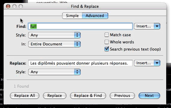
The blue halo indicates the current location of the focus in the dialog box. Normally, by pressing the Tab key with FKA on, I should be able to cycle through all available controls, i.e. not just text fields, but also buttons, pop-up menus, etc. (The Tab key cycles through the controls. The space bar and cursor keys are used to activate the controls themselves.)
Usually, the tab order goes through all available controls through the most natural order, which is from top to bottom and from left to right.
So, given that the focus in the dialog box above is currently on the “Find:” text field, where do you think a single Tab keystroke will take me?
It seems quite obvious to me that the answer to this question is: the “Insert” pop-up menu next to the “Find:” text field…
Wrong! Here where a single Tab keystroke takes me:
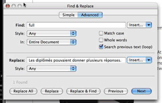
It’s the “Insert” pop-up menu next to the “Replace:” text field!
I am afraid that this does not make any sense. Why would I want to go directly from the “Find:” text field to the “Insert” pop-up menu next to the “Replace:” text field?
It makes even less sense when you consider that the next control after that (i.e. after a second Tab keystroke) is the “Style:” pop-up menu underneath the “Find:” text field.
After that, the tab order seems to be normal again, except that the cycling through the controls in the “Replace” section skips the “Insert” pop-up menu next to the “Replace:” text field (obviously, since it has already been visited). And then the “Insert” pop-up menu next to the “Find:” text field is actually reached as the first step after the row of tabs at the top (“Simple” and “Advanced”), before the “Find:” text field.
If this order were intentional, then at the very least the “Insert” pop-up menu next to the “Replace:” text field would come right before the “Replace:” text field. But, as we’ve seen, that’s not the case.
So the only logical conclusion here is that nobody at Apple has actually bothered to test this properly and make sure that the tab order for controls in this particular dialog is correct.