Word 2008: New colour for invisible characters too intrusive
Posted by Pierre Igot in: MicrosoftJanuary 21st, 2008 • 10:18 am
Based on the evidence in Word 2008, Microsoft’s idea of “innovation” is to sit on their (monopolistic) laurels for 15 years and then, when they finally get some decent competition (from Apple’s iWork), to vaguely attempt to copy what the competition has done.
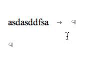
Here’s a perfect example. For years, the colour of invisible characters (tabs, paragraph marks, etc.) made visible in Word was a pale shade of grey:
When Apple’s Pages first came out, they used a sky blue colour instead of a shade of grey. I personally found that that blue colour was too dark and too intrusive when editing documents with the invisible characters made visible.
Thankfully, later on Apple added an option in Pages’s preferences to customize the colour used for invisible characters. You could now use any shade of any colour that you liked. I settled on a paler shade of blue and everything was fine.
Now Word 2008 comes out and what does Microsoft do? It changes the default colour for invisible characters from the perfectly fine pale shade of grey that it was using in previous versions to… a much darker shade of sky blue:
And guess what? It is not customizable (at least not as far as I can tell).
So basically in Word 2008 we now have to live with the flaw that we had to live with in Pages 1.0. And we’ll probably have to wait until Word 2012 before we get the option to customize this far too intrusive colour.
Thanks, Microsoft.