iTunes 6: Still using antiquated Aqua buttons in smart playlists
Posted by Pierre Igot in: iTunes, MacintoshMay 18th, 2006 • 8:39 am
When you edit or create a smart playlist in iTunes, the criteria are defined as “rules” and you can have more than one rule for a given playlist. In order to add or remove rules, you use the “+” and “–” buttons that appear on the right-hand side of the dialog. But here’s what these buttons look like:
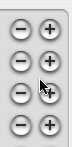
Is it just me, or do these buttons really look like leftovers from the very first flavour of Aqua that was inflicted upon us back in the good old days of Mac OS X 10.0? They definitely do not look consistent with the rest of the modern Aqua look introduced in Mac OS X 10.3.
Here’s what similar buttons used in the Finder’s dialog for finding files in Mac OS X 10.3 (i.e. before the Spotlight era) looked like:
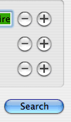
The drop shadows are much more subtle, the buttons look flatter, etc.
The buttons in iTunes definitely look out of place in the current version of Mac OS X. And, of course, it doesn’t help that, elsewhere in the Mac OS X interface, the Plus and Minus buttons used look completely different:
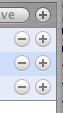
We have two problems here: Why are the buttons in iTunes still based on the older Aqua theme that has been banished elsewhere in the Mac OS X interface? And why are these buttons so different from the ones used in Tiger’s Finder for editing smart folder criteria?
After all, what exactly is the difference between editing smart folder criteria in the Finder and editing smart playlist criteria in iTunes? In both cases, we are talking about defining criteria that combine logically to identify the items that will be included in the “smart” container in question. Shouldn’t the Mac OS X interface use the same type of buttons in both cases?
Granted, it’s a purely esthetic issue. The ugly look of the buttons in iTunes doesn’t prevent me from using the buttons. But really you would think that, more than five years after the release of Mac OS X 10.0, Apple would have had time to clean up their software and remove the last remaining traces of old technology… if only in the name of user interface consistency.
I also doubt that this is in any way related to the fact that iTunes is now a cross-platform software application that is also available for Windows. For one thing, by the time iTunes for Windows was first released, Apple had already evolved the Aqua look from its initial features. And then there are all kinds of other aspects of the iTunes interface that make use of the very latest design choices made by Apple, including less-rounded corners, dark unified windows, etc.
So really there is no reason why iTunes 6 should still be using these antiquated Aqua buttons in its interface. It’s yet another example of Apple paying less and less attention to details, no matter how “unimportant” they might be.
May 18th, 2006 at May 18, 06 | 10:48 am
“Why are the buttons in iTunes still based on the older Aqua theme that has been banished elsewhere in the Mac OS X interface?”
Yes, why does Apple use custom controls instead of their very own system controls?! I personally think this is Very Bad Behavior. As you’re pointing out, it introduces inconsistencies between apps and, in this case, it looks like the custom controls were never updated when new looks arrived.
I really think Apple needs to update the Aqua look in system releases and NOT on an individual app basis. This would also let Developers access the same looks that Apple is using. It’s pretty ridiculous the amount of customization and re-engineering that has to be done if you want to build an app that has the current Apple look. (Not to mention the difficulty in deciding what IS the current Apple look.) A major advantage of Apple’s dev environment is lost if I have to spend time recreating what should be standard instead of my own unique app code.
Ahem. /rant over. :)
I guess Apple could consider the squarish windows and updated looks of iTunes 6 and iLife 6 as selling points. I don’t really see that though. I wish they would at least take the look and make it system wide for consistency in a later dot release (e.g. 10.4.5 or 10.4.6).