Pages 2: More disappointing performance
Posted by Pierre Igot in: PagesMarch 6th, 2006 • 3:40 pm
Last week I wrote about the poor live window resizing performance in Pages 2.
It’s not the only area in which Pages 2’s performance levels are decidedly substandard.
Take the “Styles” drawer, for example. I use styles all the time, so I have this drawer open at all times. (Unfortunately, it’s the only way to access styles in Pages, either to define them or to apply them.)
This drawer provides some rather strange visual feedback.
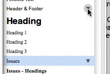
Typically the current paragraph, character and bullet style of the selected text or the insertion point in the window’s main area is highlighted in pale blue (regardless of your preferred selection colour).
If no style is used, the top-most item in the list is highlighted instead (“Free Form” for paragraph styles and “None” for character styles and bullet styles).
The highlighted style also has a small down-pointing triangle next to it in the list, which becomes highlighted with a grey disc when the mouse is hovering over it:
![]()
This is meant to indicate that this triangle is actually a button that you can click on to pull down a contextual menu giving you access to a variety of important style-specific commands:
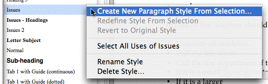
And that’s fine. What is no so fine, however, is what happens when you start moving your mouse up and down the drawer (without holding the mouse button down, of course). Whenever your mouse is over another style in the list, Pages makes the down-pointing triangle visible, and also highlights it with the grey disc when the mouse happens to be exactly on the triangle:
The problem here is that, if you move your mouse up and down the list fast enough, Pages completely fails to keep up with your mouse movements, and ends up slowly highlighting each and every triangle between your point of departure and the destination of your mouse movement. If you have a fair number of styles, this can cause a significant slowdown and forces you to wait until Pages has caught up with you before you can click on the new style. (More exactly, you can click on the desired style before Pages’s visual feedback has caught up with you, but your click will only be registered once Pages has recovered from the slowdown.)
This is all the more unacceptable that this particular visual feedback has very little purpose. Sure, it shows you that Pages tracks your mouse movements over the “Styles” drawer in real-time—but if it’s so slow, doesn’t the visual feedback defeat the purpose of this visual tracking in the first place?
If things are that slow on my G5 Quad, I dare not imagine what they are on a slower machine. For the record, this is reproducible with a blank document in Pages 2 with only about 10 styles in the paragraph styles, even without moving the mouse pointer around like a maniac.
You can avoid the visual feedback and the associated slowdown by keeping your mouse pointer off the “Styles” drawer while you are moving it up or down and only entering the “Styles” drawer area when you are near the level of the style you want to select. But this is rather ridiculous.
(Note: There are some cases when the visual effect described above and the associated slowdown don’t occur at all—but it looks to me more like a bug than anything else that they fail to occur. If you are in such a situation, try resizing the entire document window and see if the visual effect doesn’t return after that.)
March 6th, 2006 at Mar 06, 06 | 6:34 pm
This kind of UI is really not acceptable; I really hate having to hunt around with my mouse pointer to find out where the UI elements are hiding.
The undisputed world champion in this category of UI abuse is, of course, Microsoft Word. (At least you can turn things like tool tips and the like off, or at least sort of off.)
How is the user supposed to know that this stuff exists if it is invisible in the default state? Telepathy? Give me break.
March 7th, 2006 at Mar 07, 06 | 3:14 am
This is zippy as can be for me on a G4 Mini (1.25) with 256 MB RAM. It has no problem at all tracking with my mouse movements up and down the styles drawer, whether I’m just over the middle of the drawer (drawing triangles) or over the triangles themselves (drawing triangles and highlight circles).
If I flick the mouse very quickly across the drawer, I can see it drawing all the triangles in sequence, and it does lag slightly behind the mouse; but it’s split-second stuff at worst.
I don’t have any explanation for this, as your machine should be oodles faster than this thing.
Warren: the triangle which discloses the menu is always visible for the current style. It’s a logical extension to assume it’s present for other styles as well, and the visual feedback makes it clear that you don’t have to select (and apply) the other styles to edit them. Having a full column of triangles always present would be quite cluttered.
March 7th, 2006 at Mar 07, 06 | 9:13 am
Dan: you are right that the triangle is always visible for the selected style, but then of what value to the user is the change-of-state to the button on mouseover? It just looks cool, I guess, but that leads to the lags in the UI when the machine is under load.
My argument, of course, is that Pages does this change-of-state to be more like Word. This kind of pointer-driven visibility stuff is bogus because it serves no purpose in providing information to the user and it is potentially misleading. Whoever is in-charge of the UI stuff at Apple right now is, I think, not really a Mac user–at least that person does not think that the old-school Mac UI guidelines should be enforced and that Apple can do whatever it wants even if it makes no sense.
March 7th, 2006 at Mar 07, 06 | 9:51 am
Dan: The speed of the visual feedback does indeed seem to vary quite widely. I’ve done more testing, and if I quit Pages 2 and then relaunch it and just open a blank document, it’s pretty fast and not really disruptive. But as soon as I open a fairly large document (40 pages) and keep a couple of other document windows open, it starts to slow down again, to the point that it has an impact on my work.
If the visual feedback in the Styles drawer only performs acceptably (i.e. without interfering with my work) on a G5 Quad when working on a single blank document, then I am afraid my complaints are still valid.
Warren: My post was primarily about the performance issue, but I agree that the UI itself is questionable. While the triangle is always visible for the currently selected style, for other styles it only appears when the mouse is over them (and has a grey disc if the mouse is on top of the triangle itself).
Why Apple chose to use the triangle for the mouse-over visual feedback, I do not know. They could have chosen to change the colour of the background for the entire line instead. It would be more consistent with the mouse-over effects that people are familiar with on the web.
Most importantly, however, whatever the mouse-over effect is, it should not have any impact on performance and usability. If it does, it’s better not to have any mouse-over effect at all.
The other evidence that this is a rather poor design choice by Apple is what happens when you click on the triangle for a style other than the currently selected style. If you click anywhere else on the line, it selects the style and changes the style of the current selection in the document. But if you click directly on the triangle of a style other than the currently selected style, Pages 2 doesn’t select the style, but pulls down the contextual menu, with three available commands: “Redefine style from selection,” “Rename Style,” and “Delete Style.” You can do these three things to the style even though it’s not selected. It’s a rather strange behaviour.
I believe that the core issue in all this is that the Styles drawer is the ONLY way to access and use styles in Pages 2. It’s very limiting, and Apple seems to have used all kinds of UI quirks to try and maintain this choice, in spite of the fact that it makes little sense. (Style sheets can become fairly complex and users usually need an “Organizer” type of facility to organize their style sheets without it having any direct impact on the text that is currently selected in the document.)
March 7th, 2006 at Mar 07, 06 | 12:31 pm
Using the triangle for the change of state on mouseover achieves one simple purpose: it makes it clear that you can get the menu for a style which is not currently selected. Changing the colour of the entire line introduces potential confusion about which style is selected.
I think it’s absolutely critical to be able to access this menu, primarily “Redefine style from selection,” without selecting (and therefore applying) the style. I can’t think of a better way to provide visual feedback that makes it intuitive and obvious that this can be done. Sure, you could show all the triangles all the time, but that’s ugly; and it makes your target less obvious when you want the current style’s menu.
Pierre: There’s a toolbar button-menu which allows you to select and apply styles. It doesn’t let you redefine them, but you say in the article that the drawer is the only way to apply styles, and that’s not the case. The drawer is the only way to define and edit styles, but not the only way to apply them.
Opening multiple document windows seems to do the trick to slow things down here. Long document doesn’t seem to make a difference (at least 69 pages, which doesn’t count as a long document in WordPerfect, but does in Pages, which takes five ages of men to open the thing). But if I get 6+ document windows open, and there’s some content in all of them, and the styles drawer is showing in all of them, then it slows down enough to be quite noticeable. I suspect if I left those documents open and worked for a while, or maybe closed them and opened others without restarting Pages, or some similar usage pattern, that it would slow down to the levels you’re seeing.
I mostly just work with one document at a time in Pages (I keep a project spec open in Pages, and do most of my work in a bajillion TextMate tabs), so that’s probably why I haven’t seen it.
March 7th, 2006 at Mar 07, 06 | 12:40 pm
I am still trying to put my mind around the necessity of being able to redefine a style that’s not selected based on the selection, but I guess I’ll manage eventually :). The slight trouble is that the triangle appears regardless of where you are on the line with your mouse. So the triangle appears and you click elsewhere on the line and that only selects the style—that’s it. How does the triangle work as a proper predictor that this is what will happen?
You’re right about the toolbar button. I never use it, partly because it’s limited to para styles (not char styles or list styles) and partly because it’s WYSIWYG and can quickly get long and ugly. (We don’t have a choice about the WYSIWYGness in Pages.) What I had in mind was, of course, keyboard shortcuts for applying styles, which are sorely lacking.
I work with multiple document windows all the time. I am a translator :).
March 7th, 2006 at Mar 07, 06 | 12:59 pm
The triangle is a target; the circle tells you when you’re on-target.
When working with templates especially, I often have a list of styles that closely matches the style list I want, but doesn’t match the actual formatting I want. I format the Body style, then make modifications and redefine the styles right down the list. When done redefining styles, I pick one and start typing. Since my styles are somewhat derivative of each other, it’s much easier to make the one or two modifications apiece than it would be to go back to the default style, and redo the changes I’ve already done for Body.
Sure, that’s a once-per-document process (at most; it’s usually once per template unless customers want specific formatting), but it would be annoying if I couldn’t do it my way. :-)
There are Character and List toolbar buttons which work the same way as the Style button; although Character isn’t part of the default set of buttons. But yeah, I really wish they weren’t WYSIWYG.
Ah, yes, keyboard shortcuts in Pages. I try not to think about those, because then I get angry.
March 7th, 2006 at Mar 07, 06 | 3:30 pm
Sure, we all have our different way of working, and I can see how this is more convenient for you. I still find it rather strange to be able to have one style selected (in pale blue) in the Styles drawer, and then click on the triangle for another one and choose “Rename Style…” and have the style name for that other style selected in my selection colour (but with no blinking cursor!) so that I can rename it. I don’t know, it feels more like a hack than anything else to me…
I also still don’t think the use of the triangle as a “proxy” for the whole style is a very good idea. It sort of implies that the only thing that the styles listed in the drawer are good for is to use the contextual menu that is attached to them. But this is of course not true. One very major use of the styles listed in the drawer is to simply click on them to apply them to the current selection, which has nothing to do with the contextual menu.
March 7th, 2006 at Mar 07, 06 | 4:18 pm
Just tried renaming a non-current style. Yeah, that’s dumb. (No blinking cursor? And the actual current style loses all indication that it’s selected? WTF!?)
We’re all used to being able to click on an item in a drawer to use it; I don’t think that feature is de-emphasized or “hidden,” because it’s such a fundamental assumption.
The basic visual — a selectable list with an extra icon to the right providing application-specific behaviour — isn’t that unusual. Finder’s sidebar, iTunes’ source list, iCal’s to-dos, Safari’s download window — all are lists of selectable items along with extra icons to the right, with the hot-tracking circle effect.
Unlike Pages, the extra icons are always visible, and it’s only the circle that’s hot-tracking. However, since Pages is only duplicating the context menu, not providing a specific function, I think it’s logical that their implementation is similar but a bit de-emphasized.
Of course, it’s not worth a performance hit, and I know the effect would get annoying if it was slowing me down, as it is you.
March 8th, 2006 at Mar 08, 06 | 10:46 am
WTF indeed! This kind of thing might be tolerable in a 1.0 product, but not in a (supposedly) more mature product.
It’s true that we are all used to being able to click on items in drawers. So there is really no need to any mouse-over effect at all. I think Apple chose this particular visual effect just because they thought it was cool/neat. Sadly, it has very real performance issues. I don’t mind cute/neat/cool as long as it doesn’t interfere with my work.
I still say the whole thing is a debatable UI. As Warren said, we shouldn’t have to “discover” semi-hidden things by mousing over them. An alternative would have been to use a contextual menu like the one in Adobe palettes. Same round button with triangle, but a single copy of it in the top-right corner of the palette/drawer, always visible, and applying to the selected style when one is selected.
And I still say that Pages should have a proper style editor/manager in a separate window.
March 8th, 2006 at Mar 08, 06 | 5:09 pm
I’m with you in disliking the Minesweeper-esque interfaces where you have to mouse over elements (or, worse, click on things that don’t look clickable) to discover UI features.
However, I don’t think this is a hidden feature. It’s just an alternative interface to the context menu for the styles. If you take the triangles away completely — including the one for the current style — you lose no functionality, you just lose an aid to discovering the functionality. Right-click or Ctrl-click brings up the context menu as one would expect.
In other words, in this context, I think the triangles serve more as an interface reminder than an interface discovery mechanism.
Okay, I suspect I’m beating a dead horse now. :-)
The main problem with the Adobe palette model is travel distance. The menu would sometimes be quite far away from the selected style. (Adobe’s implementation has a bajillion other problems too, but I’m assuming for the moment you’re talking just about centralizing to a single button.)
If Apple were to do that type of implementation, I suspect it would be the “gear” Action menu-button, as in Finder’s toolbar, or Mail’s source list. (The Action menu and Pages’ triangles are both tied to keeping a single-button mouse usable by providing alternate methods of reaching the context menu.)
March 9th, 2006 at Mar 09, 06 | 10:47 am
Yes, an “Action” menu might work, although Pages already has a “+” menu at the bottom of the drawer. The problem is that there can be up to three sections in that drawer, and that more than one style is selected at the same time (one para style, one char style and one list style), so there would have to be an action menu for each section.
Oh well. Maybe the current interface is the best possible. Still doesn’t solve my performance problem :).