iTunes 5: About those lines…
Posted by Pierre Igot in: iTunesSeptember 14th, 2005 • 3:53 pm
I must admit I can’t remember exactly when it started. Maybe it was with iCal:
![]()
Maybe it was with Safari:
![]()
I can’t remember. But at some point Apple started using buttons with this subtle 3D effect where the top half of the button is in one shade of gray and the bottom half is in a slightly darker shade, and the line dividing the two halves curls up at one end (on the right-hand side) and curls down at the other end (on the left-hand side).
You can clearly see the similarities with the standard Aqua button theme:
![]()
But overall it’s a flatter look, with a more angular 3D effect. I don’t know what this kind of button is called. When I look at the “Buttons” section of Apple’s Human Interface Guidelines, I can’t see anything about them. And I am not a developer. But I do notice that Apple is using them more and more, primarily in brushed-metal applications.
For example, in iTunes itself, Apple uses this look for the Play/Pause and Fast Forward and Rewind buttons. This is not new in iTunes 5. It was already the same in previous versions, and the same buttons are used in QuickTime Player, for example.
What is new in iTunes 5, however, is the use of a similar visual effect in the pseudo-LCD display at the centre of the main iTunes window:
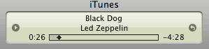
It’s not quite the same in that it doesn’t have the curled endings. (Otherwise, it would look too much like a button, I suppose.) But these two shades of beige and the dividing line that they create in the middle are definitely new.
I suppose it gives the pseudo-LCD display a more “glassy” look. The problem, however, is that this pseudo-LCD display only ever contains three lines of text, and that the middle line of text is, well, right in the middle of it. This means that the line created by the new visual effect runs right through the middle line of text. I must say I find this rather unfortunate. The effect would probably be much more tolerable if the pseudo-LCD display happened to be contain four lines of text instead of three, because the dividing line would end up between two lines of text. But as it is now, I find it distracting more than anything else.
That’s not the end of it, though. This dividing line created by 3D visual effects affects other aspects of the interface in iTunes. Consider, for example, the way that the currently playing song is highlighted in Party Shuffle:
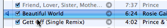
Here again, we have a 3D effect, this time with a gradient of Aqua blue, similar to what’s used for pulsating push buttons. And here again, the 3D visual effect ends up creating a dividing line right in the middle of the text. And I must say that, in this particular case, the dividing line is so dark that I find that it actually affects the readability of the text itself.
It’s much better when iTunes is in the background and the blue colouring is removed from the 3D visual effect:
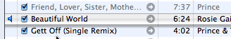
Here I find that the visual effect doesn’t affect the text’s readability at all. But when iTunes is in the foreground, it seems to me that the visual effect is overkill (drop shadow + 3D effect + blue colouring), and actually has a negative impact.
What’s the conclusion here? Maybe Apple is starting to take this glassy look a bit too far. I don’t mind it when it is subtle and does not affect the readability of text. But in these cases I find that it is interfering, and that the overall effect is not really all that pleasant.
On a side note, I was just looking at this screen shot of the new version of Microsoft Word that will ship at the same time as the next version of the Windows operating system. And look at these buttons:
![]()
Does this remind you of anything?
September 15th, 2005 at Sep 15, 05 | 10:48 am
I’ve been quite astonished lately by the design of iTunes. There is quite little consistency whatever way one likes to see it. Here are some different designs for button like controls that I can spot in the latest iTunes:
Round music controls, like Play
iTunes footer buttons, like Shuffle
links to iTMS, arrow to right inside a gray circle
custom rounded button, like Show All Songs when displaying duplicates
clickable categories in the new search bar
small round buttons in the “LCD” display
custom more rectangular buttons, like Unsubscribe in podcast view
small custom rounded button, like Get in podcast view
custom two tone rectangular button, like Sign in in music store view
Hmmm… Did I forget something? Oh yeah, the get info and preferences windows, which are unfortunately still modal and interestingly boast Aqua look, use the default rounded Aqua button.
So the total is 10 different designs for buttons and I did not even count every design found in the iTMS’s weird web layout.
September 15th, 2005 at Sep 15, 05 | 2:16 pm
Yeah, it’s a bit crazy, isn’t it? Then again, there are thousands of different buttons used by web sites, so I guess people are getting used to clicking on all kinds of things that look more or less like buttons… Not sure it’s a good thing, though :).