Adobe Reader 6 and font smoothing
Posted by Pierre Igot in: MacintoshOctober 3rd, 2003 • 10:36 pm
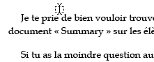
Whatever type-rendering engine Adobe’s Reader 6 for Mac OS X is using, it is obviously not doing a very good job. Look at the following portion of a PDF document displayed in Adobe Reader 6:
and then the exact same portion of the same PDF file in Mac OS X’s Preview:
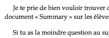
The font used here is Book Antiqua, a TrueType font — but the problem is pretty much the same with every font, although things seem to be a bit worse with TrueType fonts.
I wouldn’t mind Adobe using their own proprietary rendering engine instead of Mac OS X’s built-in one if the results were of equivalent quality. But this is obviously not right, and is painful to read on screen when saving web pages as PDF files. Yuk.
October 5th, 2003 at Oct 05, 03 | 6:21 pm
The perception of a font on-screen with anti-aliasing vs. a font on paper at high resolution is obviously subjective, but if you compare the following three images:
http://www.betalogue.com/images/uploads/macosx/BookAntiqua-ActualFont.gif
http://www.betalogue.com/images/uploads/macosx/BookAntiqua-Preview.gif
http://www.betalogue.com/images/uploads/macosx/BookAntiqua-Reader.gif
I think you will agree that the second one (Preview blown up 500%) looks closer to the actual font (first one) than the third one (Reader blown up 500%). Itís especially noticeable with the “e” letter, which looks squashed (too wide) in Reader.
I donít understand why you have Font smoothing set to “Light” on your PowerBook. Apple clearly recommends to use at least “Medium” (“best for Flat Panel”) for a flat panel display. Itíll look much less fuzzy. “Strong” will look even less fuzzy (but maybe a bit too thick for your taste).
I agree that every person has different needs, and that Adobe provide more options in that respect than Apple do. But I still think that Adobe should provide the SAME options as Apple in addition to all the other options that they provide.
October 5th, 2003 at Oct 05, 03 | 1:38 am
Pierre:
We may have to agree to disagree (I still like your blog).
You said:
“Well, I think itís quite obvious that the second one (Preview) looks much more like the actual font as it looks when printed with a high-resolution printer.”
Not on *my* printer (HP LaserJet 4MP). The Adobe rendering is much more like what I see from the printer.
“Preview uses Mac OS Xís Quartz Font Smoothing, who most people agree is the best looking font smoothing algorithm on the Mac.”
I am one of those (probably a minority) who does not like font smoothing. For instance, I have Font smoothing style set to “Light” on my PowerBook G4, and it still seems a little fuzzy to me. Much of this, I admit, may be due to presbyopia, but I cannot be the only middle-aged Mac user with this condition! :-)
“As for Readerís preferences for font rendering and anti-aliasing, Iíve tried fiddling with them, and I just cannot get Reader to work right for situations such as the one above.”
I agree, Reader’s preferences are imperfect. Because of my far-sightedness (which isn’t unusually bad), I prefer high contrast (especially at edges) over faithful rendering, when offered a choice. Since Quartz’s font smoothing lowers edge contrast, it looks smeary to me. I can maximize the contrast in Adobe Reader, but have little control over Quartz, so I prefer Adobe’s on-screen output.
Mostly, I am suggesting that Quartz, font smoothing, and Apple Preview are not *universal* solutions, though they might be reasonable for many circumstances.
Best wishes,
Clint
October 4th, 2003 at Oct 04, 03 | 4:06 am
Pierre:
I am a big fan of your blog, and often agree with your criticisms of various software, so you will have to come to my aid here. What specifically is wrong with the Adobe version of the PDF? It is darker, and seems a little larger. How do you know which version (the Adobe Reader or the Apple Preview) is “correct”?
There are two things I *prefer* about the Adobe product and its darker rendering of fonts, both on the screen and when printed. First, Apple’s Preview prints PDF files unreadably light (or at least, used to — I haven’t used it in a long time). My students using the Lab’s shared iMac used to complain to me about it all the time. They attributed it to “that inferior Macintosh” until I made Adobe Reader the default for PDFs.
Second, there is a Preference in Adobe Reader that allows one to adjust the font rendering and anti-aliasing for readability. My aging eyesight cannot handle more than a small amount of anti-aliasing, or fonts become illegible and smeary. In Reader, I can darken and decrease the fuzziness to my liking.
What do you think?
Clint
October 5th, 2003 at Oct 05, 03 | 1:00 am
Well, I think it’s quite obvious that the second one (Preview) looks much more like the actual font as it looks when printed with a high-resolution printer.
Preview uses Mac OS X’s Quartz Font Smoothing, who most people agree is the best looking font smoothing algorithm on the Mac.
I am not saying that Adobe’s algorithm is “incorrect”, only that it doesn’t look as good, and doesn’t look as close to what the actual font looks like as QFS on screen.
For printing purposes, there should be absolutely no difference between the output of Preview and the output of Reader. I am talking about the differences on screen here. If you get different results with Preview than with Reader, then obviously there must be something wrong somewhere.
As for Reader’s preferences for font rendering and anti-aliasing, I’ve tried fiddling with them, and I just cannot get Reader to work right for situations such as the one above.
I have also noticed, on occasion, situations where the font smoothing on the FIRST PAGE of a PDF document in Reader looks different from the font smoothing in subsequent pages, still in Reader. I cannot reproduce it just right now, so I am not entirely sure what causes the problem, but it definitely looks like Reader is still not working quite right yet.
Thanks for your feedback.