iTunes: Why does the ‘Get Info’ command not take an ellipsis?
Posted by Pierre Igot in: iTunesMarch 21st, 2007 • 6:13 pm
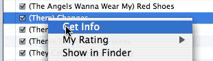
This is something that has been bothering me for a long time. (I am weird like that.) In iTunes, the menu command that brings up the track information dialog is called “” and, in the menus in which it appears (the “” menu in the menu bar and the contextual menu when you right-click on an track), it appears without an ellipsis (the “…” character):
Now, I am fully aware that the “” command in Mac OS X’s Finder does not have an ellipsis either.
And I am also fully aware that Apple’s own guidelines on using the ellipsis character say this:
Don’t use an ellipsis in the name of a button or menu item when the associated action:
- …
- is completed by the opening of a utility window.
A user opens a utility window to view information about an item or to keep essential, task-oriented controls available at all times (for more information about utility windows, see “Utility Windows”). A command to open a utility window, therefore, is completed by the display of the window and should not have an ellipsis in its name. Examples of such commands are Get Info, About This Application, and Show Inspector.
The problem, however, is that Apple’s own definition of “utility windows” is as follows:
Utility windows are either application-specific or systemwide. Application-specific utility windows disappear when the application is deactivated.
Systemwide utility windows, such as the Colors window and the Fonts window, float on top of all open windows.
You can create a modeless utility window, such as a tools palette, to present controls or settings that affect the active document window. Utility windows are useful for keeping extremely important controls or information accessible at all times in the context of a user task. Because utility windows take up screen space, however, don’t use them when you can meet the need by using a modeless dialog (the user changes settings and then closes the dialog) or by adding a few appropriate controls to a window frame.
A user can open several utility windows at a time; they float on top of document windows. When a user makes a document active, all of the application’s utility windows should be brought to the front, regardless of which document was active when the user opened the utility window. When your application is inactive, its utility windows should be hidden. Utility windows should not be listed in the Window menu as documents, but you may put commands to show or hide all utility windows in the Window menu.
Let’s review the track information in iTunes and compare it to this definition of a “utility window”:
iTunes’ track information window is application-specific, but does not disappear when the application is deactivated. If it’s visible when you switch from iTunes to another application, it stays visible, in the background.
iTunes’s track information window is definitely not “modeless.” It’s a modal dialog box. It’s not an “inspector window,” but it’s not an “info window” either. (The Finder offers both. command-I shows an info window for the current selection, while command-option-I shows an inspector window that changes depending on what is selected.)
The only non-modal aspect of the track information is the ability to go from track to track through the “Previous” and “Next” buttons, which saves you the trouble of having to (1) close the track information window, (2) select the next/previous track, and (3) open the track information window again.
But the usefulness of these two buttons is limited. If the tracks you want to edit are not right next to each other, using the “Next” and “Previous” buttons repeatedly can be tedious and error-prone too. In addition, editing the tags of a track can cause it to change its own position in the track list. And the fact that iTunes fails to change the highlighting in the track list to show you which track you are selecting by using the “Next” and “Previous” buttons makes the feature rather confusing when this happens. (The original track stays highlighted in the track list in the background, even though you have now switched to another track, so you have effectively no idea where you are in the list now.)
And finally, you definitely cannot have more than one track information window open at the same time in iTunes.
All this means that, unlike the File Info and Inspector windows in the Finder, the track information window in iTunes fails to qualify as a “utility window” from a UI point of view. From a UI point of view, it is actually a dialog box, and a (mostly) modal one at that.
And because of this, I cannot help but feel that the “” command that brings up that modal dialog box should have an ellipsis, thus warning the user that he’s going to be required to provide additional input. At the very least he’ll have to close the window in order to be able to continue using iTunes.
Of course, I realize that it’s a bit of a difficult situation. After all, conceptually at least, the track information window in iTunes is a sort of “utility window,” in that it shows the “attributes” of the selected item (the selected track). And the command to bring it up is called “.”
But ultimately, this difficult situation is the consequence of Apple’s own choices. They are the one who decided to made the track information window a modal dialog box. They didn’t have to. Or they could change that, and make iTunes behave like the Finder and support multiple individual track information windows or a track information inspector window (or window drawer, as in iCal).
This is something that I have been hoping for for a long time. I am constantly frustrated by the fact that iTunes’ track information window is a modal dialog. I’d like to have the flexibility of accessing track information through other, non-modal approaches.
I do realize that it would be a challenge, due to the sheer amount of information that is included in that track information window. But the file information windows in the Finder also contain a pretty large amount of information, with collapsible sections making it more manageable. Apple could use a similar approach (or panes) for the various sections of the track information window.
They could keep the current dialog box for those who are attached to it, and use another command to invoke it, such as “Edit Tags…,” with an ellipsis clearly indicating the modal nature of the command.
And then they could use “Get Info” and “Show Inspector” (without the ellipsis!) for commands to bring up more Finder-like track information windows in iTunes. It would be up to the user to decide whether he prefers the modal approach or more visual clutter but more flexibility with various information windows or an inspector/drawer.
Give the user some choice, I say. And make iTunes more consistent with your own guidelines!
March 21st, 2007 at Mar 21, 07 | 8:15 pm
I think the Information command never has an ellipsis at its end. And I think there’s a good reason for that. At least in how I always understood that bit of HIG.
The crucial words are at the beginning of the section that isn’t in your quote: “An ellipsis character (…) indicates to the user that additional information is required before the associated operation can be performed.”
In the case of the Get Info command the operation to be performed is opening a window. And that happens right away.
The ellipsis is not meant to say there will be a window opening. It is meant to indicate that some question will get in your way before the actual action is performed. If you’d be happy to adopt that point of view, I guess you will feel much more comfortable with the lack of ellipsis for the Get Info item – and even request such ellipses to be removed if you spot some.
March 21st, 2007 at Mar 21, 07 | 9:39 pm
Well, I guess there are different ways to read the guidelines. Apple itself regularly follows its own, shall we say, “interpretation” of them.
The problem is that the concept of “associated operation” does not really apply here, but that the action of selecting the command still requires additional input from the user to return to the previous state (i.e. to get out of the dialog that opens). My view is that commands that have an immediate effect without further intervention from the user and can only be reversed through an “undo” type of command are the ones that don’t take an ellipsis, and that on the other hand a command that brings up a modal dialog box always requires an ellipsis.
Is there another example of a menu command in Mac OS X that brings up a modal dialog box and does not take an ellipsis? There are commands without an ellipsis that bring up other windows, but these other windows are never modal.
Essentially it’s the fact that the dialog is modal that bothers me the most. The absence of the ellipsis is just a manifestation of that core issue.
March 22nd, 2007 at Mar 22, 07 | 7:22 am
All commands that only sometimes put up a modal dialogue (like any Close command or TextEdit’s convert to plain text commands) don’t have an ellipsis, which I think is also explicitly covered by HIG. But that’s another issue, I think.
I don’t remember any other situation where you get a modal dialogue. But that may be because Apple worked hard to get rid of modal dialogues.
I fully agree with your assessment that the modal info dialogue in iTunes is somewhat outdated. (On the other hand at least for the case of multiple selections I am not convinced it’d be too practical to turn in into a non-modal window because you’d have to handle the situations where someone selects some songs opens an info window, changes the data but doesn’t save it and then changes the selection. I imagine it’d be hard to come up with a UI that is non-modal yet lets you have a clear relationship between the info window and the songs it will affect.)
March 22nd, 2007 at Mar 22, 07 | 7:29 am
I for one advocate an Inspector-like floating palette, such as is found in the Finder and other applications, that can change and update dynamically based on whatever happens to be currently selected. If you have just one song selected, it’ll show everything including the title; with more than one, it’ll only show what’s relevant (and probably the checkboxes as well). Designing this palette would be an interesting UI hurdle, but one that is not terribly difficult to overcome.
March 22nd, 2007 at Mar 22, 07 | 11:27 am
ssp: the Close command doesn’t take an ellipsis because the closing action only brings up a (modal) dialog box if the document that you want to close contains unsaved changes, which is arguably an “abnormal” situation that forces Mac OS X to diverge from the normal path.
The “Make Plain Text” command doesn’t take an ellipsis because TextEdit does not technically need more information from the user about the change before making the change. It just needs a confirmation that the user is sure that this is what needs to be done, because it cannot be undone. Again, this is arguably an exception to the rule in that normally commands without an ellipsis are immediately effective, but can be undone. (See my other comment above.) This particular one cannot be undone, hence the warning.
I don’t think selections with multiple tracks are really an issue. The user would have a choice between bringing up a separate window for each track (with content similar to the track information window for single tracks) or a single inspector window (with content similar to the track information window for multiple tracks) or even the third option available in the Finder (with command-control-I), i.e. a “Summary Info” window).
The only difference between the Finder and iTunes, I think, would be that the inspector or summary window should probably be the default and the individual windows the optional behaviour, because people often select very many tracks and opening a separate window for each and every track could have catastrophic consequences. On the other hand, the Finder itself already switches automatically to the summary information window when the number of selected files is above a certain limit (not sure what the limit is), so we could have the same behaviour here too.
But these are minor hurdles. I agree with Arden that it would be an interesting UI challenge, but certainly not one that’s beyond the capabilities of Apple’s UI experts.