Mac OS X’s Finder: Ugliness when editing file names in column view
Posted by Pierre Igot in: MacintoshJanuary 13th, 2006 • 11:14 am
I don’t know about other Mac OS X users, but I, for one, find the following situation very ugly:
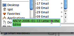
This happens when you have a Finder window in column view and you select a file or folder in a column that is half hidden (because the window is not wide enough to show it in full and you haven’t scrolled far enough to the left to show it in full).
Even if the column is not fully visible, you can still select items in it, as long as their names are long enough to appear in the section of the column that’s visible. And, because you can select these items, you can also make their names editable by clicking a second time on them.
But then you get the situation illustrated in the screen shot above. When the Finder makes a file/folder name editable in column view, it has to display it in full rather than in its abbreviated form (with the middle section replaced by “…”). But in order to display the name in full, it actually has to draw the file/folder name field in full. And because the file/folder in question is only half visible, this means that the Finder has to draw the file/folder name field on top of whatever is currently displayed in that area of the window.
In the screen shot above, the Finder has to draw the file/folder name field on top of the Sidebar! This is very unsightly. It looks like a buggy piece of software—which of course the Finder is, except that in this particular case, it’s not a bug. As far as one can tell, this is intentional on Apple’s part.
It seems to me that, in such a situation, the Finder should simply automatically scroll to the left in order to display the column in full. After all, it already does this (automatic scrolling to the left or to the right) in a number of other scenarios. I don’t think it would be shocking for the user to see the Finder scroll to the left to display the column in full. It is the column that the user is currently focusing on, and it would make sense to bring it into full focus by scrolling the window to the left.
As far as I can tell, however, Apple seems to prefer this ugliness and untidiness. (It’s not a new problem. It’s been with us for years.)
January 13th, 2006 at Jan 13, 06 | 12:34 pm
This is an interesting one, pressing return or enter to edit a name in the same situation does exactly what you would want it to do – scroll the window to the left so the full name is totally visible. This buggy behaviour only occurs when you try to edit the name by clicking.
How Bizarre…
January 13th, 2006 at Jan 13, 06 | 1:47 pm
Right, I didn’t notice that. And in fact it also does scroll if the item is already selected but not in focus (i.e. the focus is on the next column showing the contents of the item) and you click on it again.
But if something else is selected in the half-hidden column and then you click on the visible part of the name of the item to select it, it doesn’t scroll and you get the problem illustrated above.
So it is definitely a bug. Now the question is: What would it take for Apple to notice this bug and fix it? I keep thinking that there’s just no way that hundreds or thousands of Apple employees using Mac OS X on a daily basis don’t experience and notice such things themselves. It’s not like it’s an ultra-rare glitch. So surely this bug has been noticed and is on a “to do” list. The trouble is that these “to do” lists seem to remain unaddressed for years… Very frustrating.