Pages 1.0.x: Styles drawer ignores your preferred selection colour
Posted by Pierre Igot in: PagesOctober 19th, 2005 • 5:10 pm
There are various aspects of the Pages interface where a selection colour is used and Pages fails to respect your choice of selection colour (as defined in the “Appearance” preference pane), and uses a predefined pale blue colour instead.
For example, my selection colour of choice is a moderately dark shade of green (significantly darker than the default shade of green offered as one of the options in the “Appearance” preference pane).
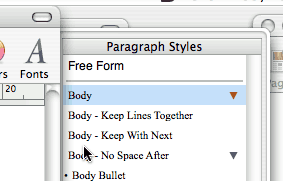
Yet in spite of this preference, Pages continues to use the default pale shade of blue to indicate the styles that are currently selected in the Styles drawer:

To me, this shade of blue looks suspiciously like the default setting for the selection colour in the “Appearance” preference pane. Does this mean that Apple actually meant to use the user’s choice of selection colour, and just forgot to flick the switch at some point in the process of developing Pages? It’s possible.
What’s for sure is that there are other window drawers in other Mac OS X applications, and they don’t behave the same way. For example, the drawer attached to a document window in Mac OS X’s Preview typically contains the table of contents (for PDF files that include one) or thumbnails for each page (for PDF files with no table of contents or for other documents with multiple pages). And this drawer in Preview does use the selection colour selected by the user in the “Appearance” preference pane.
Why does the “Styles” drawer in Pages not use that selection colour? One key reason might be that, unlike the drawer in a Preview window, the “Styles” drawer in Pages is always “in focus.” In Preview, when you click somewhere in the main window area, the focus is no longer on the drawer and the selection colour in the drawer changes from the user’s selection colour to the pale grey that indicates a selection in an element of the user interface that is in the background.
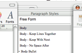
This doesn’t happen in Pages. Regardless of what you click on in the document window, the selection colour in the “Styles” drawer continues to be pale blue. It is only when the entire document window is relegated to the background that the selection colour in the “Styles” drawer changes to the neutral pale grey:

Clearly, the “Styles” drawer in Pages doesn’t behave in the same way as the drawer in Preview. This is yet another illustration of the rather ambiguous status of this “drawer” thing from a user interface point of view in Mac OS X. It seems to me that Apple has never really clarified this, and the fact that the behaviour of window drawers keeps changing from application to application and from system version to system version (remember the mailbox drawer in Mail 1.x?) is an indication that this particular UI element is still in a state of flux and neither Apple nor third-party developers are quite sure what to do with it.
(As an example, the “Documents Drawer” in BBEdit 8 never uses the foreground selection colour. The selection colour is always pale grey. In other words, the “Documents Drawer” is never in the foreground, even when you click on it. This is reminiscent of how the mailbox drawer used to work in Mail 1.x.)
To be true, there are many aspects of the Mac OS X interface where the selection colour is not the colour chosen by the user in the “Appearance” preference pane. For example, menu item highlighting is always done in blue (both in the main menu bar and in contextual menus).
And there are several Apple applications with a “source list” where the highlighting colour is always a blue gradient. This is actually a significant source of frustration for graphic designers who want a colour-neutral working environment and choose the “” option in the “Appearance” preference pane. Even when they choose “” and most of the blue stuff in Aqua changes to graphite, Apple still uses the blue gradient highlighting in source lists in applications such as iTunes, Address Book, etc.
Obviously, Apple’s reasoning might be that graphite would not be different enough from the pale shade of grey used when the selected item is in the background—and also that the blue gradient is only visible when these applications are in the foreground, i.e. when the user is not working in a graphic design application. But I am sure that there are lots of designers out there who don’t agree with this and would rather have a graphite gradient for these selected items.
(Interestingly, when the application window that uses a blue gradient is in the background, the blue gradient changes to… a dark grey gradient—as opposed to the pale grey used for regular selections. It would be rather challenging to come up with a graphite gradient that would look significantly different from this dark grey gradient!)
By the way, even when you switch to the “” option in “Appearance,” the selection colour in the “Styles” drawer in Pages is still pale blue when the document window is in the foreground. So I guess the highlighting in the “Styles” drawer has this in common with the source lists in iTunes, Address Book, etc.—even though it’s not a blue gradient.
All this makes for rather confusing and inconsistent behaviours when it comes to selection/highlighting colour in Mac OS X. I do understand that specific applications have specific needs for their interfaces, but I still don’t understand why Apple couldn’t use the user-defined selection colour in the “Styles” drawer in Pages—or a lighter shade of it. After all, Mac OS X already uses a darker shade of the selection colour in a number of contexts, such as the message list in Mail and the “Name” column in Address Book.
(The same predefined pale blue colour is also used in the “Import Styles” dialog sheet in Pages.)