Acrobat 7.0 Professional: A shameful lack of polish
Posted by Pierre Igot in: MacintoshSeptember 17th, 2005 • 11:21 am
Let’s see… This is taken from the “Startup” pane in Acrobat 7.0’s “Preferences” dialog box:

This is taken from the “Reviewing” pane in Acrobat 7.0’s “Preferences” dialog box:

This is taken from Acrobat 7.0’s “” menu:

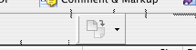
And finally, this is what happens when you take one of the subdivisions of Acrobat 7.0’s toolbar and start moving it around:
I am not talking about rare things that only advanced users will encounter once in a blue moon here. I am talking about things that every Acrobat 7.0 user can see, that are right in his face, and the only word that comes to mind to describe such a lack of polish is shameful.
It really as if Adobe didn’t care. They have never been big user interface experts, but there is a difference between providing an “ordinary” UI, and providing one that lacks even the most fundamental level of polish. This is an application that people pay hundreds of dollars for. It’s downright insulting.
September 18th, 2005 at Sep 18, 05 | 12:38 am
Totally mind-boggling how this kind of thing gets qualified as a release build. I mean, fixing buttons that aren’t sized right takes maybe two seconds in Interface Builder. But I kind of doubt that Adobe would be using modern tools for these dialogs. So it might take a whole minute or two to fix.
Maybe they think nobody notices? Ridiculous.