Pages and Word: Two different flavours of font smoothing?
Posted by Pierre Igot in: Microsoft, PagesFebruary 9th, 2005 • 7:56 am
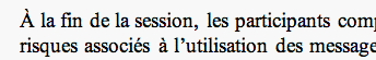
While both Pages and Word use font anti-aliasing (a.k.a. font/text smoothing), I cannot help but notice that the end product is markedly different. Here’s a paragraph in Times New Roman 11 pt at 175% in Word:
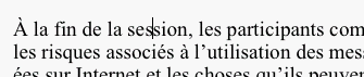
Here’s the same paragraph in Times New Roman 11 pt at 175% in Pages:
Not quite the same, is it?
It looks as if Pages does not honour the font smoothing setting specified in the Appearance control pane in System Preferences.
February 9th, 2005 at Feb 09, 05 | 9:39 pm
Surely, Pages not using the same anti-aliasing as Word is incredibly good news.
Strangely, I am getting better results than you in Word (2004). Are you using Word v. X with Quartz smoothing disabled?
I cannot test at 175% in TextEdit and I don’t have Pages yet though, but I’d be interested in a comparison between these two.
February 9th, 2005 at Feb 09, 05 | 1:59 pm
This is true. You could include a screenshot from TextEdit and I bet it would be different from the other two. Reading grayscale-aliased text is not an optimal when using a LCD-monitor.
Keynote does not do subpixel anti-aliasing either :(
February 10th, 2005 at Feb 10, 05 | 1:38 am
Strange as it may seem, I prefer the anti-aliasing in Word :). It’s thicker than the anti-aliasing in Pages, which looks too flimsy to me. TextEdit doesn’t do zooming in, so it cannot be compared.
Olivier: I am using Quartz Text Smoothing in Word, but also in System Prefs I have specified “Medium (best for flat-panel)”. You might have a different setting in System Prefs, which might explain your different results.
To me, it looks as if Pages doesn’t take into account the System Prefs setting. Regardless of what setting I use in System Prefs, the antialiased text in Pages looks exactly the same.
February 10th, 2005 at Feb 10, 05 | 2:30 am
You are right, I forgot about the text smoothing preferences. I use Standard – Best for CRT even though I have flat panel displays, because I don’t like the way the other settings use colour to anti-alias black on white text (I know, I’m not supposed to see the colours, but I do).
TextEdit does zooming if you choose Format -> Wrap To Page, although at the same fixed magnifications as Pages.
February 10th, 2005 at Feb 10, 05 | 2:40 am
Thanks – I wasn’t aware of that TextEdit command. (What the hell is it doing in the Format menu?). It doesn’t do 175%, but even at 150% I can tell that the font smoothing is not the same as in Pages. It’s the same as in Word. So the problem is definitely with Pages.
February 10th, 2005 at Feb 10, 05 | 3:58 am
It seems that Word is doing proper Quartz font rendering nowadays. A few years ago I did some comparing Word and TextEdit and they were not at all same.
Even now I would say that they are not 100% the same but both use subpixel rendering and are very similar. If i zoom the images I can see some differences but they are not great and depend on the font being used.
But yes, Pages (and Keynote) are problematic when it comes to text rendering. Hopefully Apple fixes them soon. I also hope for update on text rendering qualilty in Tiger (similar to the change between Jaguar and Panther) but I have not heard any news on this front.
I find the current font rendering engine suboptimal in some situations. For example the letter F in Lucida Grande 12pt with zoom 100%. The lower horizontal bar of the letter is very fuzzy because it is drawn with two pixels high gray line instead of one pixel high black. I understand that font rendering is not easy to do but the level of fuzziness that Quartz generates is sometimes a bit too high for my eyes.