Word X: Wrong colour for selected text
Posted by Pierre Igot in: MacintoshMarch 23rd, 2004 • 12:44 am
Mac OS X users are supposed to be able to define their preferred colour for highlighted/selected text as a system-wide setting, in System Preferences, under “Appearance”.
This colour is supposed to be used everywhere, by all applications, for highlighting text. Leave to Word X to only comply with this requirement some of the time:
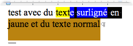
What’s going on here? Well, some of the text in this Word document is highlighted using Word’s built-in highlighting tool — which has nothing to do with selecting text, of course. It’s the word processor’s equivalent of using a yellow pen to highlight certain words or phrases in a printed text that you’re reading.
Obviously, Microsoft’s engineers thought that, since the text was highlighted in a different colour, when the user is actually selecting the text, the highlighting colour for the yellow text should be something other than the default highlighting colour for selected text (in my case, dark orange). So the text that’s already highlighted in yellow in the Word document is highlighted in blue when it is selected.
The trouble is that, obviously, this special behaviour screws up the highlighting for the rest of the line that contains the yellow text. Instead of being highlighted in the normal default colour (dark orange), it’s highlighted in… black. But on the next line the highlighting colour is back to the default dark orange.
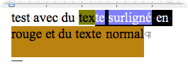
So obviously this is a bug in Word, whose mechanism for highlighting selected text fails to use the default colour defined in System Preferences, and uses black instead. And it’s not just a cosmetic issue. If the user is not aware of this bug, he’s likely to be quite confused by the variation in colour! It’s not so bad if the text is highlighted in yellow, as in the example above, but try it with another one of the default colours available in Word’s highlighting tool:
It’s starting to get quite confusing visually, isn’t it? Fundamentally, it’s just another example of sloppy programming. No, it’s not a fundamental issue, but it’s one that clearly contributes to the feeling of unease when using Word as a Mac user. it just doesn’t have the level of care for details that other software has.
March 23rd, 2004 at Mar 23, 04 | 3:59 am
Don’t let Apple off the hook on this one. ITunes doesn’t respect the user’s highlight color, and Safari only half-respects it (it’s right in the bookmark editing screen but not the bookmark sidebar). If Apple can’t get it right in their own flagship apps, surely Microsoft can’t be expected to either ;)
March 23rd, 2004 at Mar 23, 04 | 4:10 am
Well, with respect to the sidebar, it could be argued that Apple is at least being consistently inconsistent :). The “colour” used both in the Safari bookmark sidebar and in the sidebar in Finder windows is actually a gradient, and seems to be reserved for that particular purpose (selection of a sidebar item). It’s also used in the iTunes sidebar. Maybe this one will actually evolve into an Apple Interface guideline :).
No excuse for selection in the main iTunes window area, though. And I really don’t like the fact that mailbox selection in the mailbox drawer in Mail always looks like it’s in the background (neutral grey colour).
But I guess Microsoft still deserves to be singled out due to the extreme sloppiness of the result from a visual stand point. At least Apple’s faults are not as glaring :).
March 27th, 2004 at Mar 27, 04 | 10:19 pm
Out of curiosity, what should Word do if the text you’re highlighting was originally black on orange (i.e. the same thing as the default highlight colour)?
March 27th, 2004 at Mar 27, 04 | 11:55 pm
It should do what used to be done in the good old days of black and white Macs, i.e. inverse the colours (highlight in black with text in orange). The key thing is here is that the black colour used by Word for highlighting is clearly a left-over from these good old days that Microsoft hasn’t bothered to fix. Managing highlighting colours is clearly a bit more challenging in a multicoloured world than it is in a black and white world, but that doesn’t mean that developers are not supposed to try and meet the challenge.